Pool House by Stephanie Porter

Designed as a calming sanctuary for a busy family, this Sydney renovation by interior designer Stephanie Porter uses subtle detailing to elevate practical features into something rare and extraordinary.
All good interior design projects are driven by practicality, but particularly so in the case of this Woollahra renovation. The owners are active people in every sense – former athletes raising four energetic children – and they needed their home to facilitate the bustle and busyness of their lives in an aesthetically considered way. With this goal, they found their match in interior designer Stephanie Porter, who muses that this ‘practicality first’ philosophy accurately describes how she works. “For me, form always follows function, so something practical ends up becoming something beautiful,” she says.


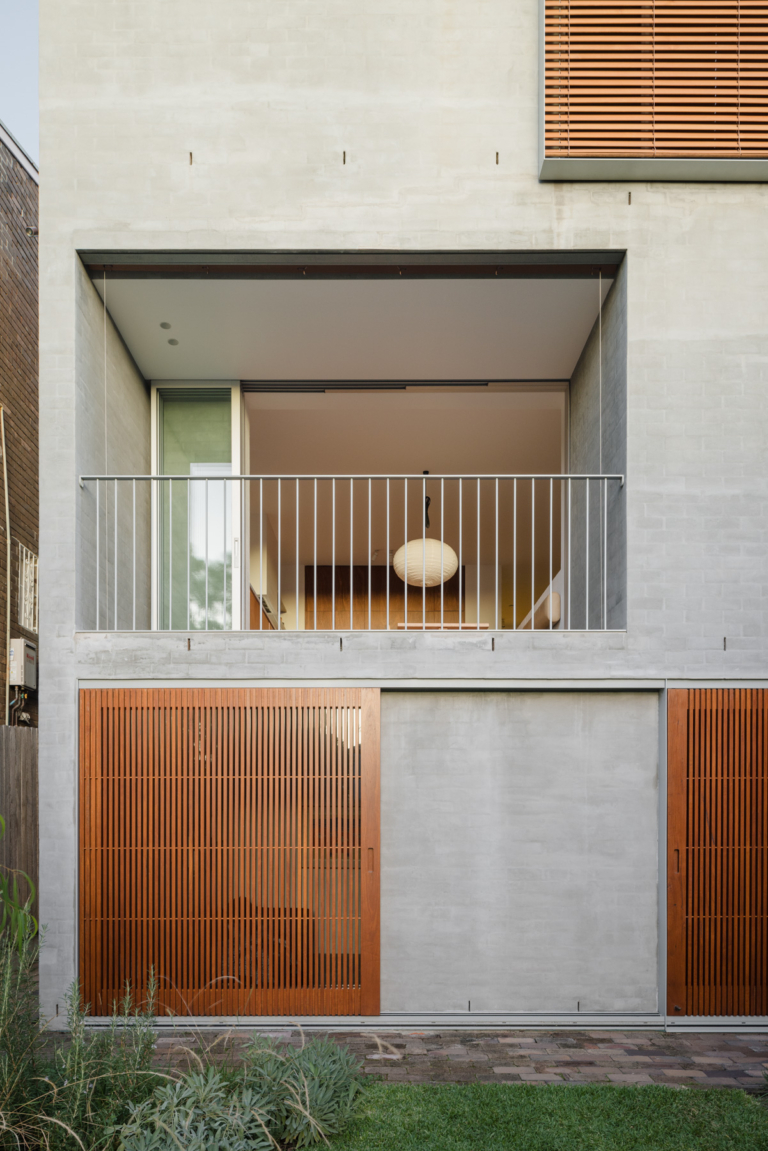
When Porter was brought onto this project, the bones of Pool House had already been established, with a top-floor extension designed by architecture studio Dods and Zuccon. Porter’s task was to make sure the interiors of the renovated abode captured the seamless flow and wide-open spaces required by a large family of very tall and sporty people – no simple undertaking in the habitually tight spaces of an inner-suburban home. “They said, ‘We want to be here forever, and we need our forever house to be functional and purpose-built for us,’” recalls Porter. “That was a dream for me: to produce something long-lasting, with that longevity and direction behind it – to do it once and do it well.”
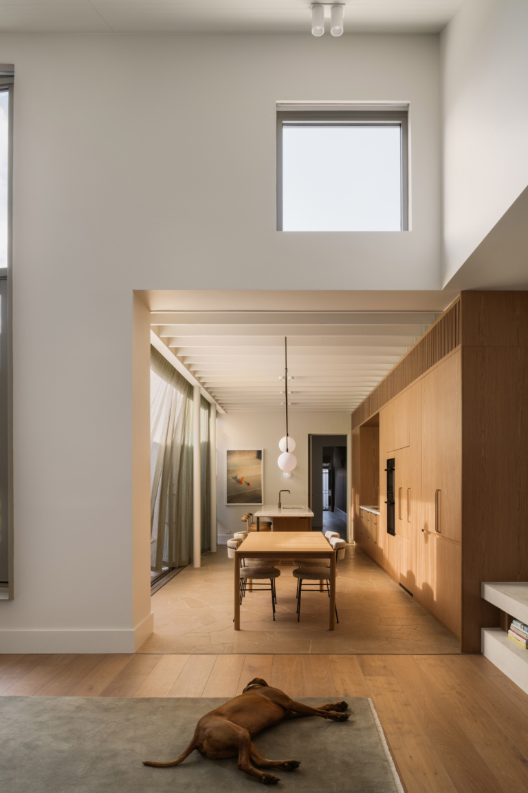
Given the family’s movement and activity, the homeowners wanted Pool House to be contrastingly still and serene. Porter explains the brief: “The client said, ‘We’ve got so much going on externally, and when we come home, it needs to be super calm, very minimalist, very clean. I don’t want stuff everywhere; I just want a refuge.’” The dwelling was a true blank canvas, with few features to build on – or be constrained by – so Porter was very selective about the details she brought in. For instance, the skirting boards, which lack ornamentation, instead make an impact with their size – they’re much taller than standard – and a 10-millimetre shadowline at the top of the recessed form. “They’re recessed into the wall because I was trying to reduce the amount of impact coming into the space at every juncture – you get the practicality of the timber but a very clean finish,” she says.


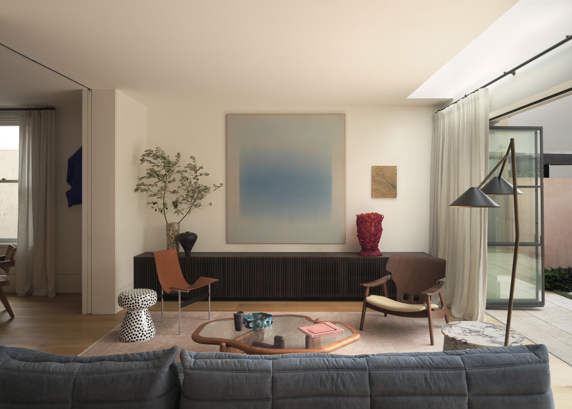
Similarly, the colour and material palettes are designed with cleanliness and calm in mind and are dominated by milky, pale hues and an emphasis on texture. The walls are a masterclass in bringing softness to hard surfaces, an effect created with Venetian plaster in shared spaces and micro-cement in the bathroom. Limewash in the main bedroom makes for a calm parental retreat. “The light comes through the front windows, and there’s so much beauty in the interplay of light on the limewashed walls,” says Porter.
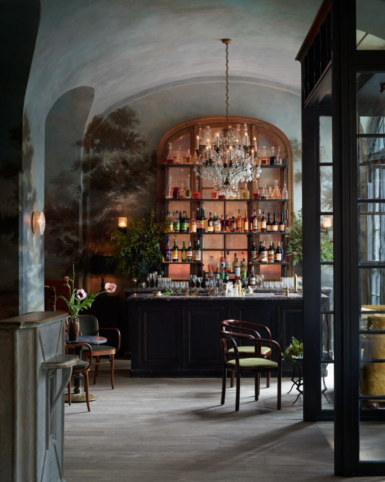
Though largely contemporary in tone, the design also needed to acknowledge the heritage of the home. Most of the original internal detailing had been lost, but the charming essence of the property remained in the adorable heritage facade, as well as the location, which Porter describes as feeling almost like an English village, tucked incongruously into the heart of Sydney’s Eastern Suburbs. The interior designer paid homage to the original period home in selective, thoughtful details. Primary among them is the gracefully curved ribbon balustrade, which has been highlighted with gloss white paint – the only shiny element in the soothingly matte material palette.


While it was important to be respectful of the original building, Porter also wanted to downplay the contrast between the prettiness of the home’s front and the strong, clean lines of the back to ensure a seamless flow throughout. “One of the biggest things was the floorboards,” she says of the natural oak flooring, which she specified in the widest board she could find. “I wanted to minimise the divisions and make the spaces feel as big as possible,” she says. Porter also had them laid with expressed joints; unlike modern floors, which have a tighter fit, the deliberate gaps mimic the expansion allowance seen in older flooring.
Given a brief that prioritised simplicity, Porter says she had to find opportunities to inject personality without compromising the unfussy elegance the client wanted. In the first instance, she did this by stretching the definition of a neutral tone, luring the owners away from their vision of white minimalism and towards swathes of deeper colour. The dining room is a great example, featuring walls of khaki joinery that bookend an open fireplace in carved travertine. The light-filled kitchen – a soft vision comprising Dulux Beige Royal cabinets and blue-veined white marble – is balanced by a solid bank of timber cabinetry stained a dark shade of navy. “It’s a big, open space, and they didn’t want a light over the island or anything fussy, so it needed grounding,” says the interior designer. “That depth of colour pulls you into the central hub of the house and makes it feel safe.”


The second opportunity for injecting personality was with the lighting. “They don’t have a lot of art, so I wanted to make the lighting as artistic as possible,” says Porter. “While they’re very classic and pared back in their approach to design, lighting is an unexpected way to create personality, and I wanted to make the most of that opportunity.” Table and floor lamps have become sculptural design moments, while the Vibia Plusminus light is a room-defining contemporary artwork, contrasting with the vintage marble dining table below. As with other design devices throughout Pool House, the effect is subtle – it surprises and delights, without compromising the serene tone of the home.
Architecture by Dods and Zuccon. Interior design by Stephanie Porter. Build by Ivison Constructions. Landscape design by Spirit Level. Furniture by 506070, Anibou, Armadillo, Dimitri Vargas, District, Domo, Mama Casa, Rainbow Studios, Stephanie Porter and Tamsin Johnson. Accessories by 506070, Apartment 91, Bisonhome, connie and vi, Craft Victoria, Cultiver, District, Grandfather’s Axe, Hein Studio, Planet, Ricca Okano, Riedel, Saint Cloche Gallery, Sands Made, Space Furniture, Spence & Lyda, The DEA Store, The Hub General Store and The Viewing Room. Lighting by Euroluce, Fineworks Paddington, Great Dane, Koda Lighting, Vibia and Volker Haug Studio. Artwork by Caroline Blackburn, Marion Brosse, Ria Green, Graziela Guardino, Gregory Hodge, Ruth Levine, Clementine Maconachie, Katie Manekshaw, Lara Merrett, Martin Poppelwell, Marisa Purcell, Hiromi Tango, Raukura Turei and Katarina Wells.