Dulux Reveals its 2025 Colour Forecast
As we navigate a world marked by uncertainty, Dulux’s Colour Forecast for 2025 offers a palette designed to nurture and uplift, reflecting a collective yearning for warmth and positivity in our living spaces. The forecast reveals a shift towards soothing and comforting hues, providing a much-needed sense of security and joy, and is distilled into three distinctive palettes: Still, Recollect and Emerge. Each is each designed to evoke a unique emotional response and align with current design trends.
“During uncertain times, we often see a move towards muted colours and calming pastels that help us feel grounded.”
Dulux’s annual Colour Forecast – led by the brand’s colour and communications manager Andrea Lucena-Orr, colour manager Lauren Treloar and colour forecaster stylist Bree Leech – is grounded in extensive year-round research into global and local design trends. Since its inception in 1999, the forecast has consistently provided valuable insights into the colours expected to influence Australian interiors and lifestyle.
And in 2025, warm neutrals are set to shine. “One of the most significant shifts this year is the increase in warm neutrals across the three palettes,” says Lucena-Orr. “During uncertain times, we often see a move towards muted colours and calming pastels that help us feel grounded and provide relief from everyday stresses.”
Still integrates biophilia and eco-friendly materials, emphasising quality and craftsmanship with pieces that avoid flashy elements in favour of understated luxury.
The Still palette introduces warm greys, yellow-based neutrals, subdued greens and serene cool blues, creating an atmosphere of calm and tranquillity. This palette encourages a deeper connection with nature, infusing spaces with a sense of serenity and grounding. “This year’s selections are designed to lift spirits and provide a sense of comfort and warmth,” says Lucena-Orr.
Texturally, Still integrates biophilia and eco-friendly materials, emphasising quality and craftsmanship, with pieces that avoid flashy elements in favour of understated luxury. Stone ceramics, wood, organic cotton, linen and hemp feature prominently, complemented by patterns with primitive line work, contributing to a sense of circular sustainability.
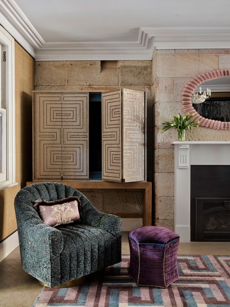
In contrast, the Recollect palette delves into moodier, more reflective tones, perfect for those seeking nostalgia and sophistication. Deep olive shades, yellow-based greens and rich wine hues from grape to plum create spaces imbued with elegance and warmth. “Dulux Plum Sauce, for example, adds a level of sophistication and the feeling of cosiness we’re searching for,” says Lucena-Orr. This collection reflects a trend towards classic design and unique vintage pieces, with dark timbers and high gloss finishes enhancing the sense of opulence.
The Emerge palette bursts with optimism and joy, featuring soft and mid-tone hues such as soft greens, mauves, orange-based pinks and greyed off-lilacs. This palette celebrates individuality and connection through an eclectic and expressive style. It embodies a sense of optimism and collaboration, reflecting a joyful and inclusive approach to interior design. “Coloured bouclé, soft velvet and buttery suede set a cosy mood, while large-scale terrazzo brings a bold and textured statement to floors and countertops,” explains stylist Leech. “In artwork, digital imagery and quirky florals take hold in a mix of pastel and bolder hues serving as focal points.”
Dulux’s Colour Forecast for 2025 offers a thoughtful guide for transforming interiors into havens of comfort and joy. By embracing these palettes, we can create spaces that not only reflect the current emotional landscape but also provide a sense of warmth and connection in our everyday lives.
Artwork by Berny Bacic, Clare Brodie, Rachel Castle, Adrianne Dimitrakakis, Robbie Harmsworth, Ali McNabney-Stevens, Maryanne Moodie, Nicole Nelius, Simône Serle, Sasha Vatoff and Jan Vogelpoel.


