‘Doing More With Less’: Transforming a Tiny 1970s Apartment
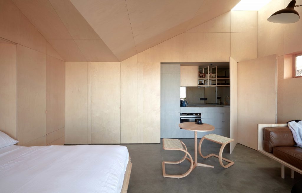
In a tiny 26m2 studio apartment, architects Liz Walsh and Alex Nielsen have created a space that at first appears strikingly simply, yet which gradually unfolds like an intricate jewelry box to reveal its full complexity.
#TheBaeTAS, as the project is known, exemplifies the architects’ approach of ‘doing more with less’, combining a pared-back material palette with cleverly integrated joinery and services to provide all the necessary functionality while staying true to the qualities of calmness and simplicity.
#TheBaeTAS began life as a 1970s top-floor apartment, divided into miniscule rooms with a low, flat 2.4m high ceiling and carpeted floor. The architects removed the walls to create one main space and a bathroom. Raising the roof in two places generated volume, height and drama, with skylights opening the space to the sky. ‘Light from the skylights tracks across the apartment throughout the day, and the raised points of the ceiling create zones’, says Liz. ‘The birch plywood paneling also creates a sense of volume’, she adds, ‘and the walls and ceiling flow into each other, wrapping the space’.
The birch plywood joinery that lines the walls blends seamlessly with the surroundings, hiding the foldaway bed and covering the kitchen until required. Joinery that conceals and reveals on demand was key to ensuring the apartment was functional and flexible. The architects were aware that ‘unless you are 15 years old you don’t want to entertain your friends on your bed’, so the foldaway bed and hidden kitchen ‘enable the space to compartmentalise and conceal its domesticity, allowing alternate modes of use and flexibility within the tiny 26m2 footprint’, says Liz.
While the apartment is small, the architects carefully considered where they could compromise on space and where they could be generous. The small bathroom is balanced by an oversized shower lit from above by a skylight that creates a sense of luxury. The entire bathroom is tiled in rich burgundy, harking back to the building’s 1970s heritage and, combined with brass tapware, adding ‘a touch of glamour’, Liz says.
Simple lines and brass fittings are woven into the kitchen, which is also striking for its use of materials – the architects experimented with barestone, a fibre cement sheeting traditionally used for exterior cladding. ‘We loved the suedy texture and solid utilitarian character’, explains Liz, ‘and liked the idea of transforming a standard and common external cladding into something more.’ The kitchen is compact, and so they needed appliances that were practical but compact – ‘a bar fridge wasn’t going to cut it’, Liz says.
Fisher & Paykel appliances were chosen for this reason, with an integrated fridge-freezer, induction cooktop and built-in oven all fitting into the small kitchen space. The architects also chose to specify Fisher & Paykel because of their design credentials, Liz explains. ‘Their products completely fit the bill and it is so great to see suppliers that outwardly support and advocate for great design – that means a lot.’
With its pared-back, unexpected material palette, distinctive raised ceiling and clever configuration of joinery, in 26m2 #TheBaeTAS does more than could possibly be anticipated. It finds beauty in simplicity, light and tactile details, and generosity where it counts, highlighting that great design need not be reliant on space.


