A Contemporary Response to the Original Spanish Colonial Home – Rebecca Judd’s Forever Home by Biasol
The concept of a ‘forever home’ speaks to ideas of connection to place, of putting down roots and investing in creating a home that truly befits one’s lifestyle. For Melbourne design practice Biasol, Rebecca Judd’s Forever Home represented an opportunity to engage with these ideas, and to create a contemporary response to the original Spanish Colonial home.
With busy lifestyles and a family of four young children, “Bec and Chris needed their home to work in a number of ways – as an escape from their busy schedules, a place where they can easily bond with their family and a space to truly entertain,” explains Jean-Pierre Biasol. Above all, the project was driven by their desire for a ‘forever home’. Aesthetically, this meant “a place that embraced modernism and clean lines and that retained the charm of the existing fabrics of their Spanish Colonial property,” Jean-Pierre says. “For us, the concept resonated with our studio perfectly. We were able to expand on the European concept and retain its charm with our modern approach to design and filter that through a very Melbourne design aesthetic.”
For Melbourne design practice Biasol, Rebecca Judd’s Forever Home represented an opportunity to engage with these ideas, and to create a contemporary response to the original Spanish Colonial home.
A thorough understanding of the family’s day-to-day life and of the original home informed the design process and enabled Biasol to design spaces that are both flexible and functional while also highly detailed and aesthetically refined. The selected materials and finishes were key to creating this balance. “We needed to ensure the materiality and finishes we put forward were suitable for their lifestyle and their family,” recalls Jean-Pierre. “And we needed to consider their ability to host and entertain as well as spend quality time with their family whilst also providing a space of their own. All in all, the design needed to be functional as much as it was about the aesthetics,” he continues.
Both the materiality of the interiors and the elegant yet subtly playful colour palette work in concert with the plan of the home to define certain zones and areas within the home based on function. “We used colour, materials and texture to give each space their own characteristics depending on the functional aspects,” says Jean-Pierre. Where soft blush tones define the front lounge, subtle teal and green elements are used in the study. Each room thus takes on a crafted sense of individual identity against a gentle monochromatic backdrop of greys, black and white, while the design detail brings everything together to create a balanced sense of continuity. “There is a high level of consideration to materiality and design detail across all rooms to ensure flow and connection,” says Jean-Pierre. “Each space is unique and fit for purpose, so the connection is in the detail – common elements such as the custom gold brass handle, for example, were designed to work across all joinery, walk-in robes and storage units.”
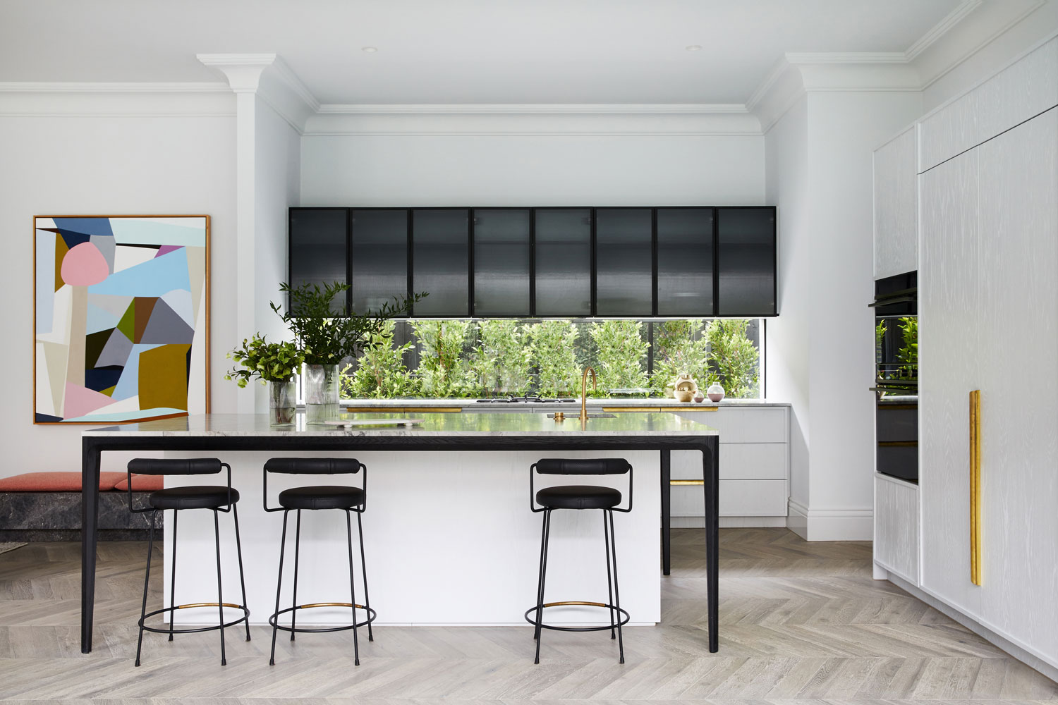
The kitchen is the heart of the home, and this is felt in the “bright and vibrant” aesthetic that at once sets the tone for the entire home while also providing a sense of distinction. “The kitchen, in contrast to the rest of the areas, took on a lighter materiality palette,” says Jean-Pierre. “It’s the gathering point and probably one of the most used areas in the home. The selection of materials and finishes was key in achieving balance and functionality within this space, setting the foundations to differentiate all other areas through purpose and colour.” The kitchen centres around a generous island, with the joinery and the layout of the integrated Fisher & Paykel appliances critical to the functionality of the space. The flexibility of Fisher & Paykel’s Column Refrigeration range enabled the positioning of the refrigerators and freezer to be customised to suit the family’s needs, with two integrated 610mm Column Refrigerators placed side-by-side in the kitchen for maximum refrigerator space, while a 610mm Column Freezer was positioned separately in the butler’s pantry.
“Services and appliances were strategically placed with consideration to how the family operates,” explains Jean-Pierre. “The equipment specified for the butler’s pantry complements the kitchen and ensures that minimal ‘mess’ was kept hidden and not in open sight.” While the DishDrawer™ and Column Refrigerators and Freezer are seamlessly integrated within the pale timber cabinetry, the only appliances that are visible are Fisher & Paykel’s signature all-black ovens, which echo the black accents used throughout the space and ensure that no metallic finishes on the oven interrupt the design intent. Of the decision to work with Fisher & Paykel, Jean-Pierre says “The team at Fisher & Paykel are fantastic and very knowledgeable, most importantly their service is exceptional and they have a range of integrated products that are functional as well as aesthetically fit for the design of our spaces.”
With the kitchen the hub of the family, the bar is crafted for entertaining. “The bar area in contrast to the kitchen took on a deeper and moodier palette,” says Jean-Pierre, with dark joinery and marble creating an appropriate sense of sophistication and luxuriance. A Fisher & Paykel CoolDrawer™ hides within the joinery, ensuring the bar is functionally self-contained while maintaining aesthetic consistency throughout the joinery. Given the family’s love of entertaining, Biasol designed each space to visually connect, explains Jean-Pierre. “It was important to us that there was a constant connection to food, drinks and entertainment. We applied a triangular ideation to the concept which provided the connection between zones and within the zones. No matter what zone you are in, between the kitchen, bar or outdoor area, you can see through to another two areas. That level of visibility ensures you are always connected.”
This sense of connection also serves to celebrate the original architecture, with the archways that characterised the original home becoming a repeating motif through which these lines of sight are established. In this way, one looks from the outdoor kitchen across the pool through an arch to the alfresco beyond. Similarly, the bar enjoys views of the tennis court and pool through steel-framed glazed arched doors, while the dining table adjacent to the kitchen looks out through a generous window onto a garden wall outside, whose arches are filled with verdant green vines. “You’ll see the arch form replicated throughout the building, in doorways and windows, as well as in the bathrooms with our custom-designed vanities,” says Jean-Pierre “We wanted to retain as much charm from the original architecture as possible, we simplified form and ensured our materials and finishes were fit for purpose whilst aesthetically it felt modern.”
With a design that responds to the characteristics of the original architecture, which drew the clients to the home in the first place, and new works which are highly tailored to the family’s needs, Biasol has created a true Forever Home.


