Maximum Effect With an Economy of Moves - BresicWhitney’s Rosebery Office by Chenchow Little
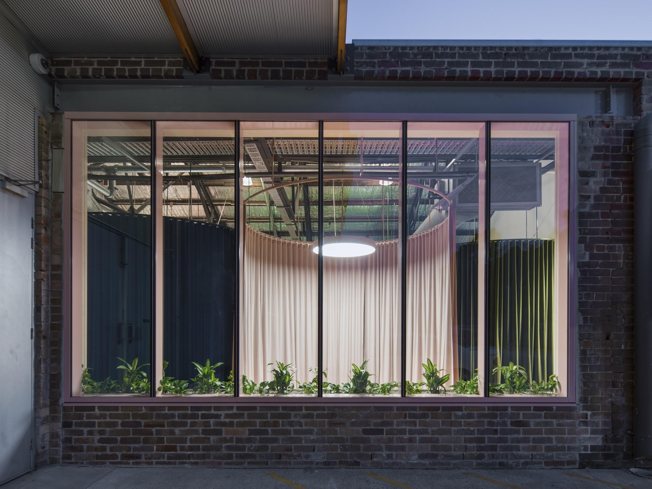
Stepping inside BresicWhitney’s Rosebery office is like entering another world, one which is defined by surprising combinations at every turn. Designed by Chenchow Little, the project could be described as industrial warehouse meets theatre stage, where velvet s-fold curtains on circular tracks alternately conceal and reveal to create a workspace unlike any other.
The Rosebery office is one of four projects Chenchow Little have designed for Sydney real estate firm BresicWhitney. Their working relationship began when Shannan Whitney approached Tony Chenchow and Stephanie Little to design BresicWhitney’s Darlinghurst office. In the foreword to the book Rosebery, which considers the relationship between the Rosebery office and the suburb’s past, Tony and Stephanie say: “We warned him that we had never designed an office before. He replied that that’s exactly what he’s after, fresh ideas. From that point forward, and working on the Darlinghurst project together, it was clearly evident that he was interested in architectural concepts and the big picture”.
As with the other three offices Chenchow Little went on to design, the Rosebery space is a physical manifestation of BresicWhitney’s innovative vision and approach to their business. In a delightful turn-of-the-century-inspired palette of olive, dusty pink and indigo blue, curtains provide a solution that is both practical on the one hand and aesthetically intriguing on the other. Eliminating the need for solid walls, Chenchow Little dramatically reduced the required budget and construction timeframe, while creating a flexible workspace that can expand or contract as needed. The result is a space that encourages collaboration, and which can be altered as the number of staff increases.
The Rosebery office is one of four projects Chenchow Little have designed for Sydney real estate firm BresicWhitney.
The design may be an impressively practical, yet the visual and emotional impact is not to be understated. The presence of the heavy velvet creates a theatrical atmosphere of anticipation and curiosity, evoking the stage curtain or perhaps a scene in a David Lynch film. Suspended from above and stopping just above the ground, an unusual impression of a substantial mass floating in mid-air is created.
Curved tracks employ a circular geometry which is contrasted with the grid of the original warehouse. The circular motif is repeated throughout the space, with coloured circles on the floor mirroring the coloured curves of the curtains above creating zoned ‘pods’ within the large open space. Understated curved birch-plywood benches flow around the several of the curtain forms, providing a subtle reinforcement of structure in the space. The positioning of the curtained pods generates a dynamic compression and expansion of space that encourages movement and guides the visitor toward the central reception desk.
“It was clearly evident that he was interested in architectural concepts and the big picture”.
The effect of this design allows is also to reduce the impact of the intervention on the original warehouse structure, living proudly within the site’s historical context rather than superseding it. The warehouse is heritage listed, and represents an integral part of Rosebery’s history as a model industrial suburb, home to both factories and homes purpose built for the workers. The restrained material palette references this industrial past – the velvet conveys a sense of luxury against which the utilitarian concrete floors, plywood furniture and exposed ducting are contrasted and emphasised.
In the book Rosebery, Imogen Eveson traces the history of the suburb, from its establishment over 100 years ago to the present day, saying “the Rosebery Estate was to be Sydney’s model industrial suburb, a working people’s utopia”. Designed to be a ‘garden suburb’ in which factory workers could live in close proximity to parks and gardens, in housing with the modern amenities of the day, and within walking distance to work. This vision speaks to the aspirations of the era and Sydney’s position as one of the largest industrialised cities in the South Pacific region.
The design may be an impressively practical, yet the visual and emotional impact is not to be understated.
Looking back at the history of the suburb provides a lens through which to view how the city has changed. Chenchow Little’s Rosebery office design provides its own architectural microcosm of this transformation, while also highlighting the possibilities for design to create solutions that are practical and while pushing the boundaries of the aesthetic.


