Colour Forecast 2026
The highly anticipated Dulux Colour Forecast has predicted the trending colours of 2026, with a move towards warm neutrals, gentle pastels, earthy tones and muted berry shades.
Each year, the Dulux Colour Forecast offers a glimpse of the hues that will shape the way we live, work and feel within our spaces. Curated by Dulux colour specialists Andrea Lucena-Orr and Lauren Treloar through extensive research, the 2026 forecast predicts a move away from stark whites and high-contrast palettes in favour of warmth, comfort and harmony.
Responding to the broader climate of economic uncertainty, digital fatigue and geopolitical unrest, this year’s forecast places a strong emphasis on tenderness and connection. “In times of uncertainty … consumers tend to gravitate toward stability in design,” says Lucena-Orr, Dulux’s colour and communications manager. “That’s why we’re seeing a continued preference for warm, comforting colours in this year’s palettes. Colour has the power to lift spirits, offer emotional reassurance and bring a sense of calm into our homes.”
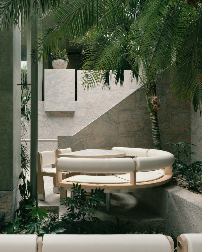
The 2026 forecast is built around three thoughtfully curated palettes – Ethereal, Elemental and Evoke – each composed of 12 hues and four complementary powder-coat finishes. With a base of warm neutrals, tans and calm greys, the mid-tone accents include deep berry and burnt caramel hues, with a wide spectrum of earthy greens and soft pinks. The palettes are also designed to extend beyond paint choices, inspiring soft furnishings, joinery, textiles and decorative accents.
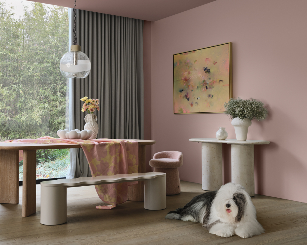
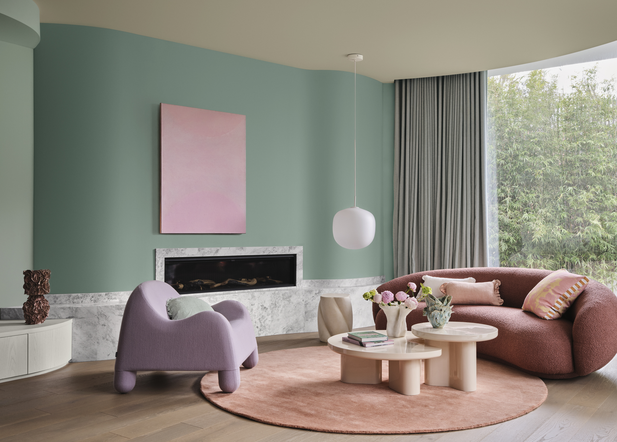
Ethereal is whimsical and dreamlike, offering a sense of escapism and refuge from the everyday. “Ethereal features a delicate, pastel-like blend of soft and mid-tone hues – gentle greens, mauves and blush pinks – that evoke a sense of serenity and joy,” says Lucena-Orr. Key pink shades include Kindness and Mask, alongside airy teal tones like Tiamo and Soft Fresco. Together, they create a light, romantic palette that works beautifully with oak, bleached timbers, plush fabrics and textural layering, as well as chrome and glass accents.
At the other end of the spectrum is Elemental, a more architectural, minimalist palette that draws from enduring natural materials. “Elemental is a tonal, grounded palette built around warm whites and neutrals such as Blended Cream and Hog Bristle Quarter and enriched with golden brown hues such as Caramel Sundae and Coffee Dust.” Cool greys and charcoal tones add depth and definition, speaking to the clean lines and unadorned forms of considered, timeless design. It pairs naturally with tactile materials such as stone, concrete, timber, leather and suede, as well as eco-conscious textiles.
Evoke is the boldest palette of the three. With retro undertones and a richer colour story, it embraces nostalgia and individuality – ideal for those drawn to maximalist styling, vintage pieces and character-driven interiors. “The colours lean into deep, comforting tones rather than bright hues.” Blush pinks, earthy oranges and warm golden tones are layered with deep berry and burnt red shades. One unexpected spike of brightness comes from Succulent, an acidic yellow-green. Evoke works well with mid-tone and dark timbers, marble, velvet, faux fur and metallic accents like chrome or copper for interiors bursting with personality.
For Lauren Treloar, Dulux’s colour and design manager, the three palettes ultimately allow for greater accessibility and personal expression. “Each palette has been thoughtfully designed, allowing consumers to mix and match shades with ease … This flexibility empowers people to personalise their spaces in a way that truly reflects their style and lifestyle.”
It’s safe to say that in 2026, colour is well and truly back – and it is being used in more intentional, emotive ways to create spaces that feel personal, comforting and expressive.
Artwork by Terri Brooks, Rachel Castle, Madeleine Collopy, Junko Go, Meagan Jacobs, Ellie Malin, Nicole Nelius, Angie Pai, Marnie Ross, Elvis Sabi, Tara Schyer, Peter Summers and Charlie White.