Firma HQ
Set within Richmond’s evolving commercial zone, Firma HQ presents a confident rethinking of what a building company’s workplace can be.
Designed by Cera Stribley for Firma Construction Group, the project is the result of a longstanding partnership where roles blur in the best possible way. Architect, client and builder operated in close alignment, allowing ideas to move fluidly from concept to construction with unusual clarity and conviction.

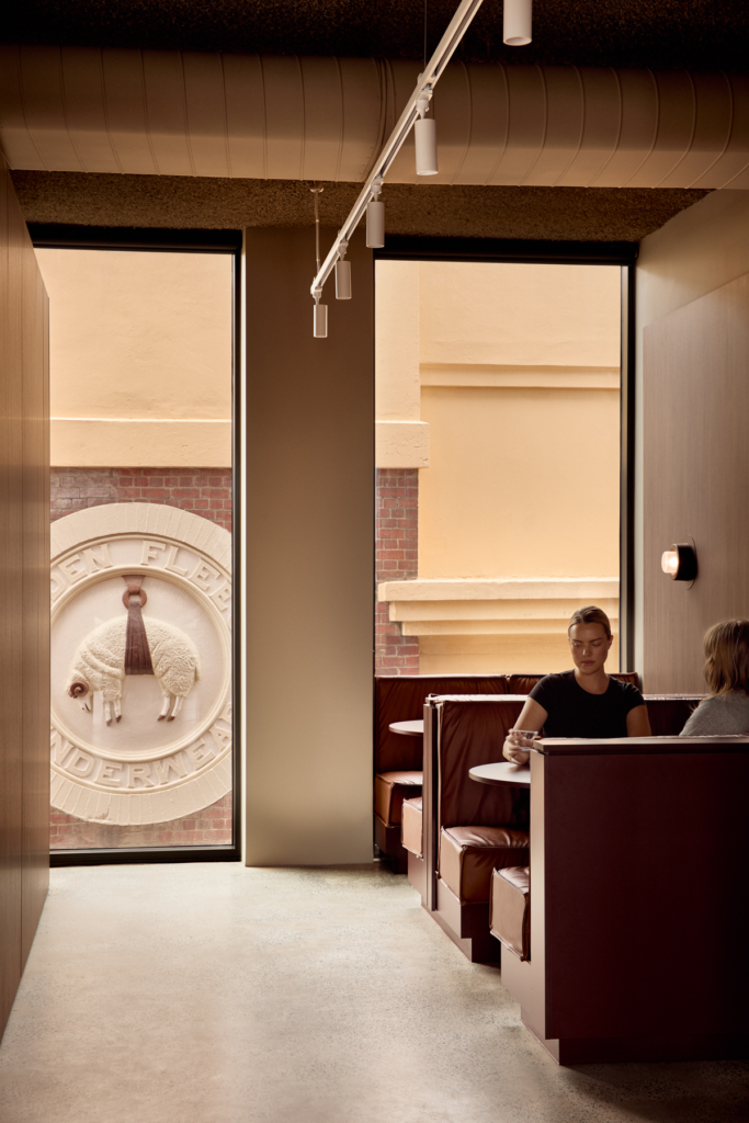
Positioned to capture expansive views across Melbourne, the office balances presence with restraint. It operates not just as a base of operations, but as a physical expression of Firma’s ethos – direct, assured and materially driven. The design resists spectacle in favour of atmosphere, where the experience of space unfolds through texture, tone and light rather than overt gestures.
A defining aspect is the elevation of cork from a secondary, often-overlooked material into a central architectural device. Rather than being treated as an acoustic afterthought, it becomes a primary surface – applied across joinery and key touchpoints. “It brings warmth, movement and tactility, while also offering practical benefits like being cost-effective and naturally acoustic,” says interior designer Felix Filbert. The decision emerged through a process of refinement, replacing earlier explorations of burl veneer with a material that felt both more resolved and better suited to the project’s ambitions.
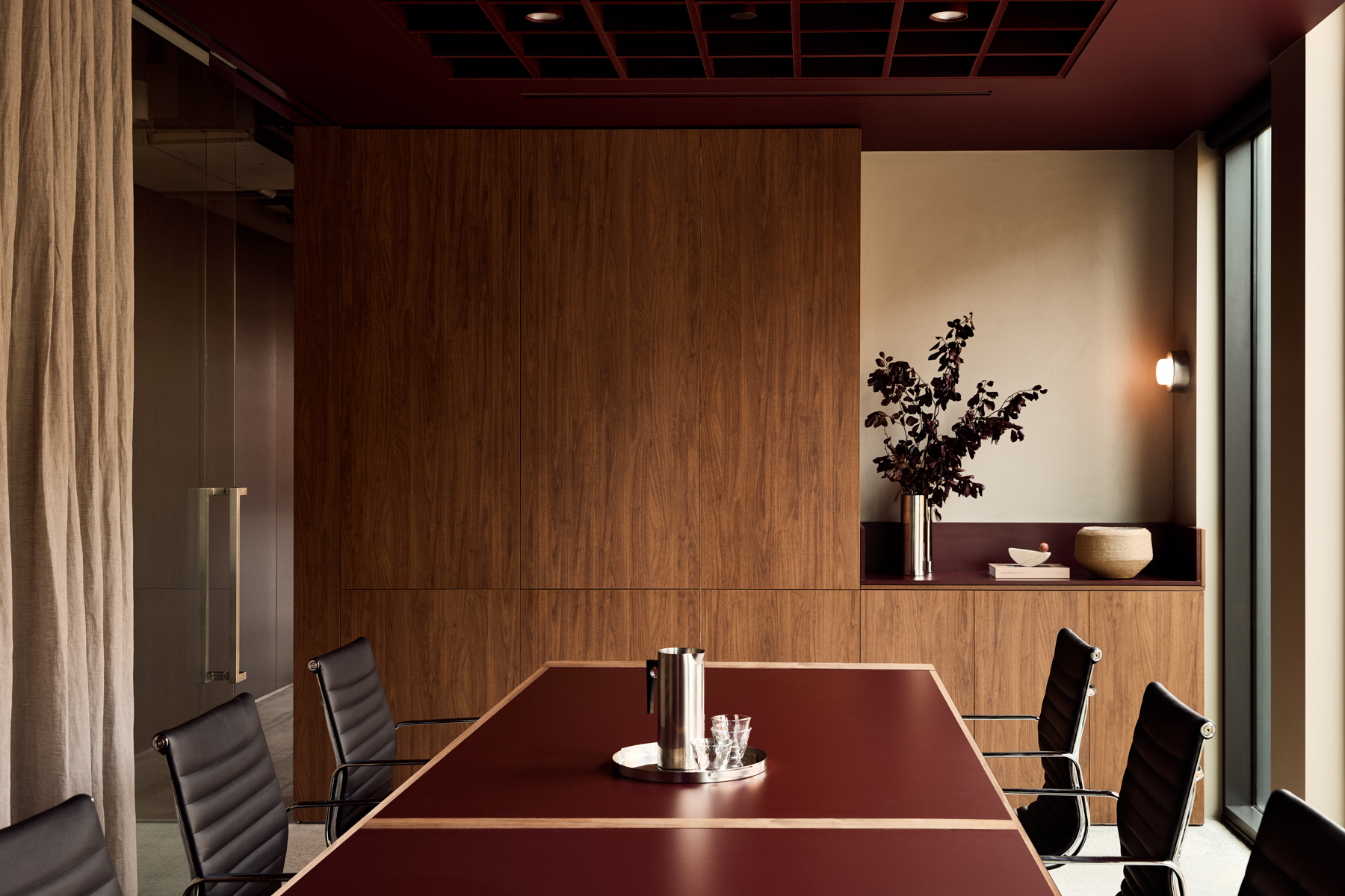
This shift signals a broader intent to challenge expectations typically associated with workplaces for construction companies. Here, tactility takes precedence over hardness, and the palette is tuned to create a sense of grounded comfort rather than corporate sterility. Deep burgundy tones – drawn from Firma’s brand identity – are used with confidence, shifting from accent to anchor. “Burgundy and coral are such a key part of their brand, so instead of treating them as accents, we started to see them as part of the project’s neutral palette,” Filbert explains. Combined with timber, muted tones and moments of steel, they contribute to an environment that feels both robust and considered.
Material contrast plays a subtle but important role throughout. The softness of cork and timber is set against the precision of stainless steel and concrete flooring, creating a quiet tension that animates the interiors without overwhelming them. Light is treated as an active element in this composition, filtering through the space to heighten textures and modulate the mood across the day.
Spatially, the layout encourages openness while maintaining a sense of focus. Work zones are arranged to support both collaboration and individual concentration, with clear sightlines reinforcing a feeling of continuity. Framed views outwards extend the experience beyond the interior, while the material palette ensures the environment remains intimate at a human scale.
Delivering a project of this nature required careful calibration. As Filbert explains, “the biggest challenge was holding onto the strength of the design concept while making sure it was still practical and realistic to deliver.” That balance was made possible by the level of trust between all parties involved. “Firma really trusted our design instinct from the start.”
This close collaboration ultimately strengthened the outcome. As builder and client, Firma was deeply engaged in the process and ideas could be tested and refined in real time, allowing the project to evolve without losing its core intent. “From the start, we wanted it to feel warm, grounded and reflective of Firma’s identity, and that really carried through in the final space.”
Rather than following the well-worn cues of the contemporary industrial office, Firma HQ leans into a softer, more deliberate expression of workplace design. Its clarity comes from a disciplined material language and a shared confidence between those who conceived and delivered it – an approach that feels less like a statement piece and more like a natural extension of the people behind it.