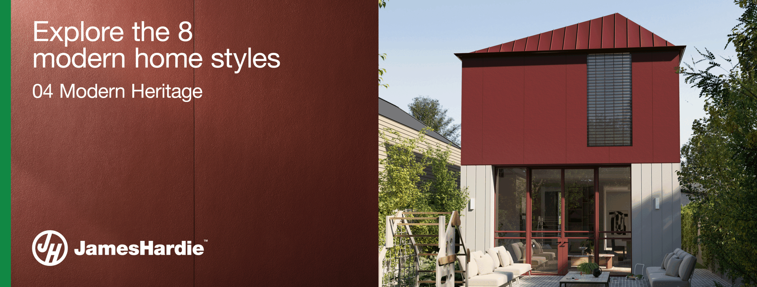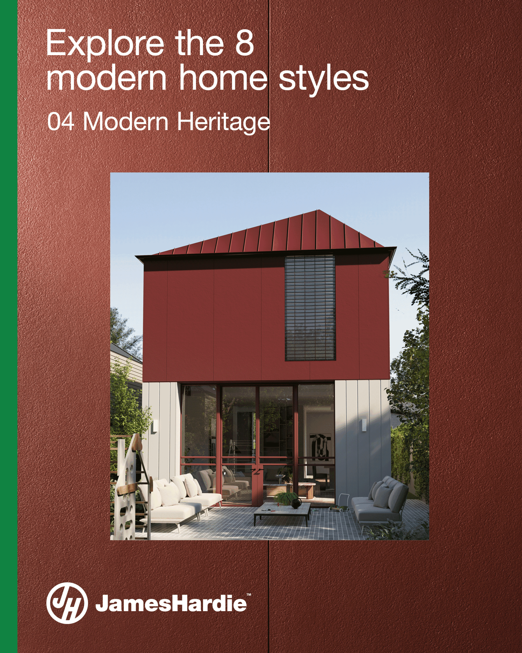

Pared-back Architectural Approach – McNamara House by Tom Robertson Architects
An original Federation-era home in the Melbourne suburb of Malvern East hides a low-lying addition by Tom Robertson Architects. In contrast to the stately, formal original building, the new design of the McNamara House is contemporary and welcoming, and where the old emphasises grandeur and adornment, the new is defined by a pared-back approach.

A double-storey addition in the style of the original had previously been proposed for the project. When Tom Robertson Architects were approached by the clients, it marked an opportunity to re-evaluate both the site and the clients’ needs, and, from here, the project took a remarkably different turn. In the place of the proposed previously proposed addition, Tom Robertson Architects envisioned a single-level contemporary pavilion that would sit discreetly behind the grand façade of the original home.

This plan arose from a thorough analysis of the site and the clients’ lifestyle, identifying the generous 17-metre wide yard behind the original home as an opportunity. “The clients are at a stage in life where, with their kids as teenagers, they weren’t going to use a massive lawn, instead the kids are going to spend time in the pool or rumpus room. We went through a series of designs and the one we all settled on was deliberately single level, so it consumed a lot of the site, wrapping around to create a courtyard,” says Tom Robertson. He explains that the siting of the new addition “was also about deliberately turning our back on the brutal afternoon sun”, and that by constructing the extension around the courtyard, the design offers views to the landscaped spaces rather than to neighbouring houses.
When Tom Robertson Architects were approached by the clients, it marked an opportunity to re-evaluate both the site and the clients’ needs.
The new plan creates a sequence from old to new, with the entry, sleeping quarters and bathrooms located in the original home, and the kitchen, dining, study, and lounge occupying the new addition. Entering the house, all the hallmarks of the original home’s era are felt in the period detailing, formal entry and high ceilings. “You experience the heritage house in the lobby, and when you arrive at the contemporary after you transition through [the old],” explains senior project architect David Ascroft.


The juncture between old and new is marked by very large timber sliding door and a marked shift in materiality. “The way the new building is expressed is as a series of deliberately subtle moves, both subversive and subservient to the existing form,” says Tom. As one arrives at the door that opens into the new addition, one encounters a robust, pared-back material palette, consisting of timber, bagged brick and steel. “The timber batten ceiling is a device that marks the transition between old and new; it also a device that leads you into the building and the main space,” David says.
“The clients are at a stage in life where, with their kids as teenagers, they weren’t going to use a massive lawn, instead the kids are going to spend time in the pool or rumpus room.”
This continues outside, where the timber ceiling is expressed externally via the spine that demarcates the new pavilion. Similarly, bagged brick is used both inside and out. The continuity of both timber and brick, Tom explains, “represents the materials in a really cohesive way and internally makes it feels solid and grounded. The client requested to use as little plasterboard as possible. You can go up and touch the brick walls and they feel substantial.” The double brick walls provide the added benefit of thermal mass and the bagged render was chosen for its ability to contribute a sense of softness and texture. However, achieving the finish proved a challenge during the construction process – patience, and plenty of trial and error on the part of the builder, were essential to achieving the consistency of the final result. “It was quite a process getting it right!” recalls Tom.
Stepping into the new kitchen and dining space, the experience is one of a remarkable lightness. “The main room is filled with light and air – it truly feels amazing,” says Tom. “Especially in contrast to the original elements, this room is open and bright, with clerestory windows bringing light into the highest reaches of the space.” Additionally, the contrast between the weighty presence of the brick and the lightness of the steel-framed glazed walls throughout the kitchen and dining space reflects the architects’ approach to the program, which balances the sunlit, open communal space with more enclosed areas of retreat.
“The client requested to use as little plasterboard as possible. You can go up and touch the brick walls and they feel substantial.”
In designing the plan, the architects looked to the use of each space. The new rumpus, study and lounge all focus on creating intimacy and an enclosed, private atmosphere, while the central kitchen and dining become the central point of all activity. “The way the spaces are ordered works really well, there’s a sense of separation from more private areas,” Tom reflects. “The kitchen is positioned so you can be standing at the island preparing food and look out at the private courtyard, the kids can roll on in from the pool, and you can greet guests as they enter.”


This plan represents possibly the biggest functional change to the original house, with the emphasis on a flexible and active shared kitchen and dining space. Yet conversely, it also harks back to the old through the positioning of the lounge, in a move away from the typical contemporary open-plan approach toward a more nuanced and considered program. While “a lot of clients want open plan, here we deliberately carved off that loungeroom to give it more privacy,” says Tom. The lounge is adjacent to the dining area, separated by both a change in level and a large sliding door. This means that entering the lounge “is an event,” David says, “you open the slider and go down a few steps to and enter a calm, quiet space.” And while the sliding door allows the space to be entirely closed off, it also presents an opportunity for connectivity through the generous opening that is created when the door slides open to interact with the dining space.

Without seeking to dwell on contrasting elements unnecessarily, the McNamara House nevertheless finds a poetic order in the juxtaposition of the formal period home with contemporary pavilion hidden behind. Structured so as to subtly emphasise the transition between the elements of old and new, the project brings them together as two contrasting halves of a singular whole.
“The way the spaces are ordered works really well, there’s a sense of separation from more private areas.”