Crafted Elegance – Simon James Showroom and Offices by Keshaw McArthur
Keshaw McArthur has transformed a warehouse in Mount Eden, Auckland, into a new showroom and office space for local design company Simon James. With Keshaw McArthur’s minimalist and elegant approach and Simon James’s respect for craftsmanship, the collaboration between the two, who share a deep passion for refined design, proved an apt match.
Once a mechanic’s garage and, most recently, an industrial and retail warehouse, the building has been reimagined to showcase Simon James’s designer pieces. With a practised restraint, the architects embraced the characteristics of the original structure, resulting in a compelling interplay between old and new. On the exterior, the form of the existing warehouse is retained; however, the polycarbonate cladding adds a contemporary feel. Further, the building has been opened up, with glazing running across the entrance façade, blurring inside and out.
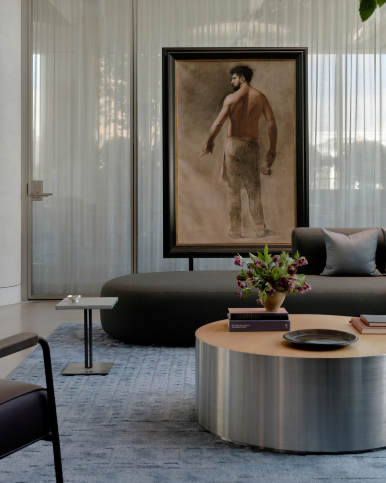
On the interior, exposed steel beams, a corrugated ceiling and polished concrete floors retain the character of the warehouse. These elements are juxtaposed with the soft texture of curtains and hanging pendant lighting. A muted palette of soft whites and raw materials underscores the sense of honest simplicity. The design’s unfussiness enables flexibility and durability, allowing the showroom to adapt effortlessly to ever-changing displays.
At nearly twice the size of Simon James’s previous space, this new showroom can display a much larger selection of products. The design of the space is cleverly conceived to take full advantage of the warehouse’s scale and natural light. A large double-height space acts as the main showroom, with offices housed in single-storey zones. The furniture is arranged in a way that allows customers to explore the space with ease. Corresponding with the placement of diaphanous hanging curtains, displays can be organised in groups while still giving a view of the entire room. Further, through the inclusion of the curtains, this astute yet simple design move acts as a method to divide space and also provide moments of attention. The furniture and objects are given room to breathe, with the architecture becoming a neutral backdrop for the materials and colour in the displays.
The furniture and objects are given room to breathe, with the architecture becoming a neutral backdrop for the materials and colour in the displays.
There is an enduring quality in doing things well. Through the use of honest materials and careful detailing, this adaptive reuse project is a testament to the value of good design. Keshaw McArthur has created a functional and beautiful space while giving the furniture and objects on display prominence. The architects’ restraint in the design approach and attention to detail has resulted in an inviting and inspiring space that encourages experimentation and variation in its display.


