Redefining the Kitchen - Carole Whiting's Tope Street Apartment
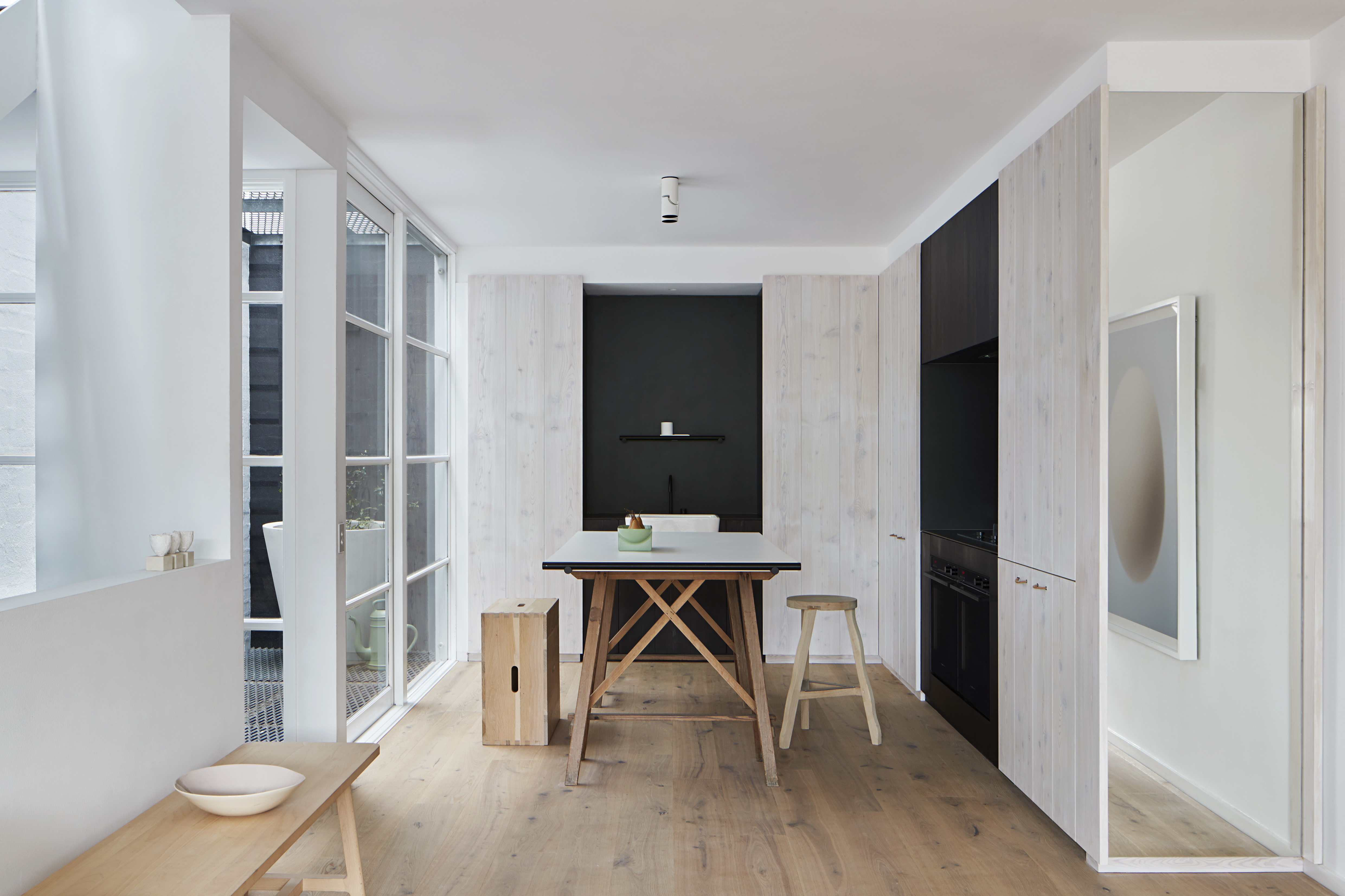
Entering the apartment of interior designer Carole Whiting, one’s expectations about the concept of what a kitchen should be are immediately challenged. In her signature monochromatic palette, the small space is a haven of tranquility, more a place of quiet retreat than typical busy work zone. Look closer, however, and it is clear the design does not shy away from utility, finding the balance between restrained minimalism and the simple beauty of truth to functionality.
Busy working on her clients’ projects, designing her own kitchen was a protracted process, Carole explains, taking over a year to complete. This was combined with the fact that designing for herself removed many of the parameters that come with designing for a client. “In many ways, it’s much easier designing for a client – when it’s your own home, it is much less straight forward”, she says.
The apartment sits atop her interior design practice, and thus there was also an awareness that the design needed to represent Carole Whiting Studio professionally too if clients visited upstairs. “Above all, I was incredibly aware that the design could not date, as I don’t have the time to be redesigning my kitchen in another couple of years!”, she says.
In her signature monochromatic palette, the small space is a haven of tranquility, more a place of quiet retreat than typical busy work zone.
A previous career in advertising gave Carole many years of experience working closely with photographers, and this now informs her approach to design. “The experience showed me how to frame things, how the eye is drawn”, she reflects. The Tope Street interior is imbued with this photographic approach – while it is defined by a sense of holistic consistency, the space can also be viewed as a collection of perfect little vignettes.
The apartment is located within a warehouse conversion, built in 1998 by a developer. “There was nothing very interesting about the apartment”, Carole says. “It felt much more townhouse than warehouse, and was very dated”. Immediately after moving in she was aware of the major changes that needed to be made, which included opening up the small space that was previously cut off by a large, heavy island bench.
“Above all, I was incredibly aware that the design could not date”.
Carole describes the previous kitchen as “very formulaic” – the same cannot be said of the new kitchen she created, which blurs the line between kitchen and furniture. In place of the traditional island bench, Carole installed exposed timber trestle legs, found second-hand on a trip to Italy. The trestle is topped with an exceptionally slim-profile large-format porcelain tile, creating a highly practical and durable work surface while simultaneously evoking the simple silhouette of the archetypal kitchen table.
“While the space is small, I was still drawn to the classic kitchen table, the centre of house where everyone gathers”, Carole says. “The formal dining table is not used as much. I love that old-fashioned concept of everyone coming together in the kitchen, whether it’s to eat or simply socialise”. The kitchen is thus as much a space for congregating with friends or family, having a quiet cup of tea or glass of wine after a long day, or enjoying a morning coffee at the bench in the sun, as it is a place of work and food preparation.
The Tope Street interior is imbued with this photographic approach.
Never the less, Carole was inspired by the apartment’s original warehouse heritage to embrace the space’s functionality. The exposed timber trestle legs are a nod to this warehouse aesthetic, as are the simple white porcelain butler’s sink, the utilitarian black rail above the sink and on the end of the bench, and the timber grain and expressed detail of the larch joinery.
Carole says that when the kitchen is used in its traditional capacity it is usually when she is entertaining, so it is required to fulfil the function of a full-size home kitchen. Carole chose to install two ovens, a black gas on glass cooktop, an integrated refrigerator and a concealed dishwasher by Fisher & Paykel to ensure that not only was no capability lost, but the kitchen in fact delivers exceptional performance when it is needed most.
Yet for all these appliances, the kitchen is remarkably seamless. “I wanted to keep all the joinery full-height, and I was careful to avoid breaking up the vertical lines”, Carole explains. She worked with Fisher & Paykel to raise the height of the refrigerator so that the line of the bottom door is the same height as the bench. To maintain the height and detail of the joinery, the standard white dishwasher is concealed behind a joinery panel rather than integrated in the usual sense.
Carole Whiting chose to install two ovens, a black gas on glass cooktop, an integrated refrigerator and a concealed dishwasher by Fisher & Paykel.
Perhaps the clearest examples of the thoughtful harmony between the design and the appliances, however, are the all-black ovens. Carole chose to define the utility areas (namely the washing and cooking zones) by staining the joinery black and using matt-black large-format porcelain tiles for the bench and splash back. “I’m known for my monochromatic black and white”, Carole says, “and in this kitchen the role of the black was in making the work spaces recede visually, as everything blends in”.
A regular oven with stainless steel handles posed a problem for this scheme – fortunately, Carole remembered seeing the prototype all-black ovens when she attended a Fisher & Paykel Future Design Workshop at the Experience Centre in Sydney. She contacted Fisher & Paykel’s Daniel Varcoe to enquire about these black ovens that would create the seamless effect she had envisioned for the space.
While these new black ovens are now available, at the time they were still in the prototype phase. Recognising the importance of the black ovens to the integrity of the Tope Street Apartment’s design, Fisher & Paykel arranged the new black ovens for Carole, in advance of their official release. “Above all, this project just reinforced to me the level of technical support available from Fisher & Paykel during the design process. I was consistently impressed by their willingness to help find solutions to complex design ideas”, Carole reflects.
The level of attention to detail in the design for the Tope Street apartment may have introduced technical complexity, yet the result is to create exceptional clarity and simplicity of line and materiality. Calm and tranquil, even minimalist, it is a kitchen designed to do more, while creating the impression of less.

![Book Flatlay Cover Front Transparent Trio[1]](https://d31dpzy4bseog7.cloudfront.net/media/2024/06/07080212/Book_Flatlay_Cover_Front_Transparent_Trio1.png)


