
For The Love of Pink

The slow burn that was the emergence of pastel colours has finally ignited in Australia, exciting interior designers and breathing new life into spaces.
Oozing retro characteristics, this nostalgic colour palette brings a contemporary flair to spaces.
While encapsulating baby blues, mint greens and shades of lilac, it is pink that has dominated popularity within the pastel palette.


Like most trends in all realms of design, Milan is at the helm of setting the tone for these trends and forecasting the direction in which design is developing.
The 2016 Milan Design Week introduced pastel pink in small bursts, resurging in presence at this year’s event.
The colour – aptly dubbed as ‘millennial pink’ -featured in many installations, setting the tone for its future in design.

After a trip to Italy last year, interior stylist Emma O’Meara couldn’t keep away from the intensity of colour she came across.
Taking inspiration from the colourful homes clutching the cliffs of Positano on the Amalfi Coast, Emma wanted to bring some of that excitement to her own home.
Situated on the Bellarine Peninsula, Emma’s newly completed Barwon Heads home radiates warmth through a modest choice of colours and architectural finishes.


While there is much white to be seen on the floors, walls and ceilings, it is Emma’s specific choice and placement of colour-pops that excites the eye.
Emma describes her home as a fusion of modern Australian with Scandinavian themes of minimalism.
‘It’s a combination of all the things I love and is completely opposite to our last home,’ she says.
While her last house was dark and brooding, her Barwon Heads ‘Casa O’Meara’ is everything but.
Each room has a different colour theme, with surprises in every corner.
The kitchen exudes minimalistic charm with stack-bonded white tiles on the splashback and island benchtop. This grid-like design is complemented by teal-green cabinetry and rangehood.
Not only is this composition pleasing to the eye, it further enhances the contemporary-retro aesthetic driven by the pastel palette.
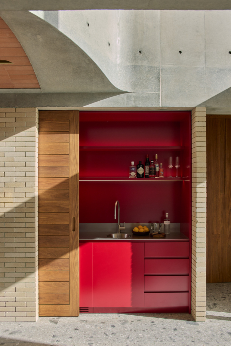
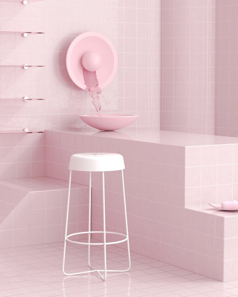
Pink is the feature colour in the master ensuite. While it is an inviting space, it equally challenges you upon stepping into the room.
It arouses a sense of being trapped in a 1950’s Californian motel room, yet snaps you back into the present in an instant.
This is a compliment to Emma as she has taken advantage of the colour palette, juxtaposing retro ideas with contemporary styling and design to ultimately create a space that exudes the ‘now’.

With all trends, the question of timelessness arises almost inevitably. The idea is to see progression and change in trends, meaning there is a constant shift between what is considered current and what will eventually fade.
When asked whether she is worried about her pastel coloured home dating quickly, her response is blunt.
“I love it, and I think that if you love something, you should just go ahead and do it,” she says.
While the experts may doubt the longevity of a trend, if something speaks to you, then it will never truly date.
The ability the pastel palette has to combine old-age charisma with modern influences is timeless in itself and will remain in the creative minds of designers and homeowners for some time.