St Martins
by Laritt-Evans

A new Brighton Café which references the colours of a modern beach life.
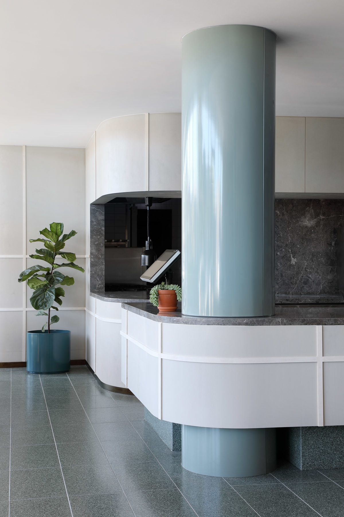
Designers Laritt-Evans took a simplistic approach to the creation of this project, by embracing the natural and simplistic colours of the surrounded beach environment.
By challenging the notion that blue and green should never be seen! Designers have encapsulated the use of bay blues, and greens inspired by leafy parks and streets and proved when using the right shades of blues and greens can be used to compliment each other, these colours can indeed compliment each other, to create a very modern and trendy; which is both airy and light.
By representing the natural beauty which surrounds this café’s locations, within a leafy bayside area of Brighton, designers explored the Fibonacci sequence, and its design existence of using natural forms through the use of exhibiting certain numerical patterns throughout each space within the café.
This resulted in a floor plan which reflects the literal translation of the Fibonacci sequence, by mixing two kinds of green Terazzo floor tiles, and combining their set-out, with that of a physical floor plan.
To compliment this design throughout the café, designers also had a customised paint colour created, which is a barely there grey and works well with the soft pastel tones within the space.
Unexpected materials like perforated blue vinyl provide accents to the green floor, lashes of marble cascading down joinery offset the other more elementary materials such a ply wood. Resulting in a comfortable, inviting space to gather and enjoy the food.
The resulting design is a surprisingly and subtle take on the brief, and something which pushes the idea of what a Melbourne cafe can and should look like.
Photography by Tatjana Plitt.
Keep up to date with The Local Project’s latest interviews, project overviews, collections releases and more – view our TLP Articles & News.
Explore more design, interior & architecture archives in our TLP Archives Gallery.
![Book Flatlay Cover Front Transparent Trio[1]](https://d31dpzy4bseog7.cloudfront.net/media/2024/06/07080212/Book_Flatlay_Cover_Front_Transparent_Trio1.png)


