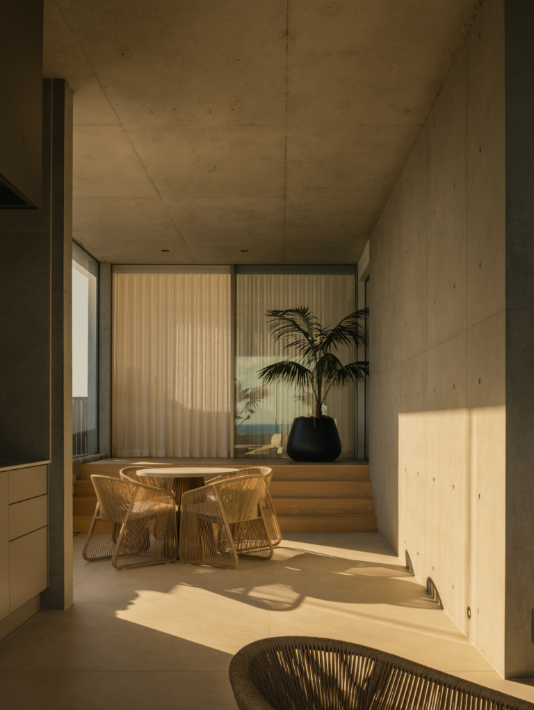
Light and Open – Armadale House by Selzer Design Studio
A substantial reworking of an Edwardian residence, Armadale House by Selzer Design Studio brings a light and airy quality to the experience of home, drawing views to the neighbouring parkland inwards. Layered, timeless materials animate the contemporary forms, while spaces work hard to maximise the potential of the compact site.
As the first home purchased by architect and designer Emma Selzer and her husband, Dan Swart, Armadale House is an intimate expression of the young family’s lifestyle – and a first glimpse of Emma’s carefully refined design sensibility as she launches her practice, Selzer Design Studio. The home’s quaint character and relationship to the rear parkland inspired Emma to pursue a language of calm and repose while emphasising light transmission across the site. “Our home evokes a deep sense of tranquillity. The ethereal dappled light cast from the park’s landscape makes this is a wonderful space to spend time as a family,” she says.
While the old home, built in the early 1900s, was liveable and full of character, Emma reveals “we saw more potential and were always thinking about how we could rework the space.” With plans to start a family, the couple sought an additional bedroom and bathroom and craved larger living spaces with greater amenity. Prior to the renovation, Emma observed how light moved through the space. “It was important to us that the new house felt lighter and more generous in scale, even though the site is compact.”
The original home’s Edwardian frontage is carefully preserved in accordance with the site’s heritage overlay. The decorative gable, weatherboard cladding and lacework trims follow a lightened palette that simplifies the building’s ornamentation, while the addition presents a recessive and contemporary counterbalance. “The new architecture is sensitive to the character of the old house,” says Emma. “It’s simple and understated, fusing metal, glass and white render.” The structures, while disparate in style, are similar in tone, subtly unifying old and new. “It was important that the two structures spoke to each other without competing,” she explains.
Internally, the home’s two existing bedrooms are skilfully reconfigured into a generous main bedroom suite. In lieu of typical downlights, ambient lighting embedded in loose furniture expresses the room’s traditional cornices, skirting and architraves, enhancing the character and charm of the heritage home. Linen drapery, a bespoke boucle-upholstered bedhead and a plush mohair floor rug give a layered and tactile expression, elevating the warmth and moodiness of the spaces. “The style is minimal,” Emma concedes, “but there’s a sense of softness and warmth that is inviting.”
In the walk in robe and ensuite, richly veined travertine offers a landscape of neutral tones that ground the space while offering subtle directional cues. Running east to west, the grain of the stone is flanked by subtly textured polished plaster wardrobe doors and a floating vanity set within a recessed niche. Emma carefully detailed the vanity as an artistic composition of materials and forms, combining polished plaster cabinetry fronts, inset travertine benchtops and integrated travertine basins. Brushed nickel tapware gracefully arches over the vanity’s travertine upstand, crafting a sculpted effect without compromising practicality.
A secondary arched opening propels movement to a linear bathing niche, where the travertine flooring extends into a curved shower alcove lit by a skylight incision. “The narrow floor area was once a tiny ad hoc bathroom that sat against a four-metre-high boundary wall,” Emma recalls. “The skylight works with these constraints to draw in natural light and animate the subtle texture of the walls’ polished plaster finish.” A brushed nickel towel rail emphasises the linearity of the volume, while a combination of sharp and rounded elements is playfully intertwined. A small powder room accessed from the entry corridor follows a similar language, merging deep, figured stone with contemporary brushed nickel fixtures and a striking glass-bulb wall light.
Passing through the corridor, a change in floor level marks the shift to the new addition – a long, open volume comprising living, kitchen and dining spaces opening onto a shaded rear garden. Full-height glazing lines the south and west elevations, drawing in natural light and landscape. “It’s a serene setting that brings calm to the chaos of young family life,” muses Emma. Given the tight proportions of the space, a skilful approach to planning was essential to maintain a sense of generosity. Emma sought to capitalise on space at every opportunity, while applying a reductive approach to joinery to give clarity between settings.
Following Emma and Dan’s love of entertaining, the kitchen island is designed as a point of focus. Spanning nearly four metres in length, its robust block-like form of vein-cut travertine shrouds the kitchen’s operational properties in a refined and sculptural gesture, creating a gathering place around which daily activities can intuitively occur. “The linearity of the travertine complements the volume of the room,” says Emma. “The stone was actually the last material chosen to complete the palette, and it was such an important decision in tying all of the tones and textures together.” Complementary grey oak floors, white lacquered cabinetry and polished plaster walls create a soft, tonal effect that, she says, “feels calming, timeless and airy.”
The kitchen’s preparation spaces and a compact laundry cleverly nestled below the stairs are concealed behind a bank of elegant bi-fold doors. Appearing as a floating, panelled backdrop to the kitchen island bench, Emma reveals, “the joinery is carefully designed for everyday living but can be easily closed to look presentable and uncluttered.” By orientating the kitchen perpendicular to the rear garden, the house capitalises on the full width of the site and allows for a generous entertaining zone that extends outwards to the garden.
Centred on an established Queensland brush box in the neighbouring park, the rear garden benefits from the tree’s broad canopy – a source of privacy and shading for the family. “When looking through the glazing out toward the park, we often feel like we are living amongst the treetops,” says Emma. A small pocket courtyard at the centre of the home brings additional light and vitality to the main living space, where a large mirror on a sliding track thoughtfully conceals the television from view and reflects the rear garden’s lush foliage. Soft-leaved Boston ivy brims the garden’s perimeter, while Japanese maple trees reflect the changing seasons, their deciduous foliage shifting from verdant green to shades of deep autumnal red.
Discretely positioned behind the kitchen wall, the stairs to the upper level are set over a dramatic double-height volume flooded with western light. “It’s one of my favourite moments in the house,” Emma says. The vertical threshold affords privacy to the two kids’ bedrooms, which are
thoughtfully positioned to each capture views across the courtyard and garden, the western room extending sightlines to the tree and parkland beyond. While separated by a shared bathroom, the alignment of the two bedrooms allows the floor to be opened to create one large playroom. Emma explains that “the kids love having their own domain and from the main living spaces, visitors don’t necessarily know that the second level is there.”
Throughout, Armadale House is layered with texture and colour from Emma’s highly curated selection of furniture, art and décor. Dan, who owns Melbourne-based Hali Rugs, collaborated with Emma to create several striking, bespoke pieces. These include the luxurious dusty blush-toned mohair rug in the main bedroom, the entry runner that pays homage to the old home by merging traditional and contemporary design, which Emma attests is her favourite – “it was an exciting opportunity to explore texture though a traditional style rug. It brings a sense of tonal uniformity, but on closer inspection is highly detailed.” Furniture was meticulously selected with comfort in mind, ensuring every space was appealing to occupy for hours at a time. A wall of rare music photography collected by Dan takes pride of place in the entry, a personal display and memorable talking point for visitors.
Responsible for the full scope of the house from initial planning down to the finest details of the interior and landscape design, Emma is exceptionally proud of the built outcome. “It was an incredible opportunity to oversee every element and pore over every detail,” she says. The resolution of material junctions and seamless correlation between Armadale House’s architecture, interior and landscape crafts an inviting and enduring platform for family life to unfold – “the lifestyle of living on the park in our newly renovated home makes us feel very lucky.”


