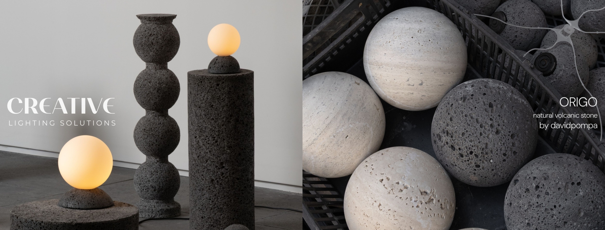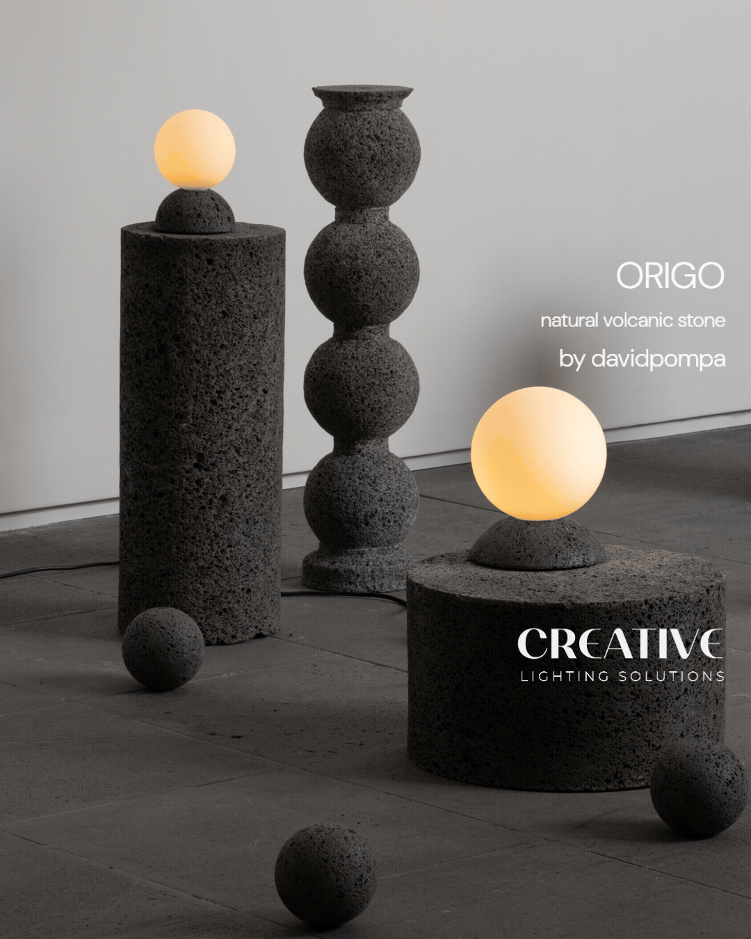
Rustic Revival – The Gallery House by Workroom
Meditative yet modern, The Gallery House by Workroom breathes a sanctuary-like air far removed from its surroundings. The three-storey home, situated in the Melbourne suburb of Toorak, is a contemporary departure from the post-war-era landscape in which it rests – an emblem, perhaps, of the dualities it harbours within. Whilst the façade is monochromatic and megalithic, the interior is pervaded by an earthy warmth. Yet, the indoors and outdoors sit on the same plane, exemplifying an osmosis of nature and the built form.
The brief for this project was notable for its dualities. “The clients wanted a keenly tailored home that was sumptuous yet subdued, private, but with great curb appeal,” says John Bornas, Creative Director of Workroom, adding that “this gave us the freedom to experiment with material, form and scale.” When Workroom took on the project, the site held a modest post-war home fairly typical of the area. So, in a bid to up-end the local architectural archetype, the team decided to tear down the original dwelling and start from the ground up, literally. “We used the idea of a courtyard house to achieve privacy. But instead of a single courtyard at the heart, we created a series of them,” John explains. The move was rooted in a plural sense of purpose – to blur the boundary between the interior and the landscape in a way that afforded maximum privacy. By the same token, and in keeping with the studio’s minimalist signature, Workroom opted for a muted palette to keep things cohesive and give each material equal pride of place. “We used a combination of concrete, stone, timber, terrazzo and linen to bring in warmth, colour and texture. Together, these materials reflect and filter light, create depth and add layers to each space,” John notes.
From the street, the house looks almost at odds with its surroundings, courtesy of the angular, monochrome façade that hides the entrance in plain sight. As the home slowly reveals itself, it is evident that the aesthetic idiosyncrasies only keep getting better. The entryway, for example, is characterised by a Zen courtyard garden and a concrete staircase that riffs equally on being sculptural and spartan. The latter, John reveals, “is a space to pause, to transition from the street to the house. It urges people to look around and wonder how it may have been built.” For its design, the team reconceived the familiar spiral in a raw finish, using curved stone to counterbalance the agrarian aesthetic. “It was a challenge to execute but our building partners, Davies Henderson, took up the gauntlet and nailed it.”
With an interior palette that alludes to the outdoors, it appears almost as if Workroom might have turned the landscape inside out and veiled it across the walls. “We wanted the materials to inspire a sense of continuity and for the home to manifest the same spirit inside and out,” John describes, citing the cobblestones beneath the staircase that hold a mirror to the landscaping as an example. The ruminative shell of the entryway is echoed in the living and dining areas, which, with their hushed hues and pared-back design language, channel a gentle meditative vibe. In the same vein, the demarcation between the common areas and the bedrooms is made by way of subtle split levels, with the latter located towards the back of the property at a slightly lower elevation. Meanwhile, luxuriant gardens flank the living room on either side, making it unclear where, or whether, the built form really ends. The visual fluidity continues indoors; in an effort to maintain a sense of seamlessness between the upper and lower floors, Workroom fashioned a double-height ceiling at the very centre of the home, in such a way that the kitchen, dining and living spaces can be viewed from any level. “We used an interplay of heights to create zones,” John explains. “The shorter spaces are used as gateways to the taller ones.”
When it came to natural light, a considered approach was key. “Light, be it natural or artificial, can make or break a project. Rather than having light enter indiscriminately, we designed interventions that would help tease it into the right space at the right time,” John avers. Employing a combination of clever orientations, angled openings and screening and reflection, Workroom went on to conceive a spate of sun-dappled settings. “Light isn’t one-dimensional, and neither are our buildings. However, in these inner-city properties, you are often limited when it comes to orientation. Usually, the optimum orientation is not achievable, so you need to get creative. We try to have light enter the house from different directions, but the quality changes as the day wears on. To land this evolving light in the best way really is the crux of the design scheme and something we continually strive for.”
Despite the modernity of the architecture and interiors, there is an unmistakable storybook quality to each room, thanks to the bounty of windows with picture-postcard vistas. “Whether it be the main garden with the pool or a smaller secondary courtyard, there is an aspect of the outdoors to every room,” says John. “We always envisaged the courtyards and gardens as extensions of the indoor spaces. It really does give each space a little more room to breathe.”