Precise Yet Unbound – Hepburn’s Road House by Warren and Mahoney and Detail by Davina Sutton
Located on a linear site framed by two lush shelterbelts, Hepburn’s Road House by Warren and Mahoney and Detail by Davinia Sutton is best described as a series of distributed pavilions. Conceived as a home that can cater to the clients – a couple and their daughter – as well as to guests, the home’s ability to be experientially specific and loose is just one of its many favourable attributes.
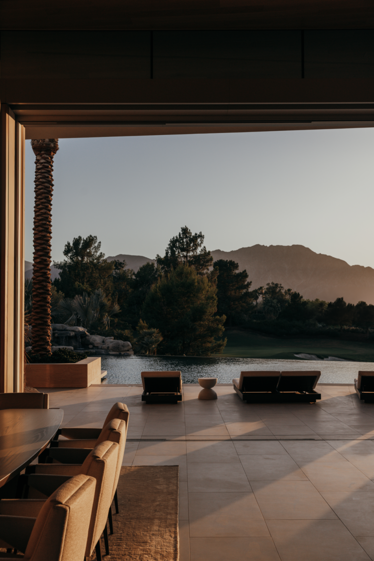
The clients were drawn to the site for its context in New Zealand’s Canterbury Region and its potential as a large flat parcel of land. Inspired by an existing Warren and Mahoney project in Queenstown, they were eager to explore a similar pavilion-style typology and, as architect Richard McGowan says, the site lent itself well to this pursuit. “Typically, a site offers a whole set of constraints such as views or topography [that] then inform the architecture, but this site was long and flat; it was perfect for what we collectively had in mind.” As such, the architects have employed a pavilion-style floor plan – a strong reference to the early work of Warren and Mahoney founding partner Sir Miles Warren – set among a “constructed landscape of constraint”. Richard explains, “we ended up dividing this long, rectangular form into a series of rooms, which you gradually move through starting from the road along the eastern boundary.” First, there is an orchard followed by a large grassy expanse and the dwelling itself that, when traversed through its centre, leads to a maintained lawn area with hedges. Beyond this, there is a meadow, trees and the Canterbury foothills.

The distributed pavilion idea is eloquently executed in the dwelling. Divided into three symmetrically stacked volumes – each with gabled roofs – the home is modest in expression but generous in experience. “This idea that the house could shrink to fit its occupants existed from the outset,” Richard explains. As such, each pavilion serves a different function; the primary pavilion, located in the centre and “on the view side of the house,” contains the main living areas and kitchen; the second – to the right – houses the master suite and a study; and the third – to the left – is dedicated to guests with three generous bedrooms and an ensuite. “On the one hand, it can be a one-bedroom house for the clients, but it can also expand for visitors,” Richard offers. As well as this, the home has been conceived with a certain level of pliability. Additional pavilions or “planted rooms” can be seamlessly added later, allowing for a “loose fit” as opposed to an entirely prescribed outcome from the beginning.
Whilst there is clear demarcation inside the three pavilions, the exterior is uniformly expressed. Clad in traditional bevel back weatherboards, the home reads as a hermetic form within the landscape; the trio of gabled roofs and concrete expression of the primary pavilion are the only indication of the more nuanced floor plan within. All the windows of the private pavilions feature sliding, full-height timber shutters with black steel frames and fixed blades that “conceal and deny” the various openings. They are highly functional, too; they can be used to direct natural light and ventilation as required across the changing seasons. As Richard explains, “from a distance, you have a monolithic form with disguised windows, but it also means you can modify the sun and air from within.”

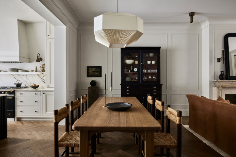
In contrast to these concealed openings, there are “crisp, square, steel framed picture windows” at the gable ends of each of the pavilions. They provide visual reprieve from the rigidity of the form and are also a nice nod to Warren and Mahoney’s quintessential 1960s-era projects. One of these vast picture windows is located above the stovetop in the kitchen, framing views of the garden. “The opportunity to cook at a surface, engage with others and also look out a window – instead of at a splashback – is pretty lovely. It’s these things that open up the experience,” Richard notes. Davinia worked hard to achieve a sense of layered refinement in the kitchen, selecting finishes and appliances fitting for the home’s design and the clients’ cooking habits. On the view-facing countertop, there is a combined Fisher & Paykel Induction and Gas Cooktop with a generous amount of bench space either side, as well as two Combination Steam Ovens and an Integrated Insert Rangehood. Also, the Column Refrigerator and Freezer and Column Wine Cabinet are both seamlessly integrated into the joinery. As Richard says, “the current Fisher & Paykel range has the level of sophistication that we used to have to look further afield for.” He adds, “the products are well-engineered, pragmatic but elegant as well.”
As Davinia points out, whilst the aesthetic was intended to recede, it was important that the kitchen have a strong presence given its prominent location. “It needed to be well grounded in its layout and detail,” she says. As such, the finishes include natural and engineered stone benchtops and stained oak timber floors laid in a herringbone pattern. She adds, “soft, matte painted and stained veneer joinery are the finishing touches; applied to reflect the form and detail of the architecture, they provide a modern twist on the traditional cabinetry style panelled door with the use of a hidden handle detail within the frame.”


At the other end of the pavilion, the dining area complements the kitchen in both design and usability, and the Fisher & Paykel CoolDrawer sits neatly within the joinery. As Davinia says, “further attention to detail can be seen in this area.” She adds, “a change in the joinery detailing – with the application of box frame doors and woven brass metal inlays – has deliberately been used to reinforce furniture-like detail rather than a built-in approach.” Finally, in the laundry, the Fisher & Paykel Washing Machine and Heat Pump Dryer, both in a graphite finish, round out the selection.
The design of the kitchen cabinetry reflects the quiet and rational approach employed across the project. “It’s not a pretentious house; it’s quite modest,” Richard offers. “But it has some really nice pieces, like the hoods above the window seats.” Located in-between the kitchen and living area, the first of these two window seats is tucked into a kink in the floor plan, allowing for an alcove with a large window that follows the pitch of the roof. “It’s a window in the plane of the roof with a shade hood over it like a pair of sunglasses, which gives you the form and the drop shadow from the outside, and controls the light in the house,” Richard explains. Adhering to the home’s affinity for symmetry, the second window seat is located at the southern end of the pavilion in an identical kink in the plan. As an interpretation of a specific briefing requirement, these window seats demonstrate Warren and Mahoney’s aptitude for considered gestures that are responsive to both the site and the client.


Simultaneously precise and unbound, Hepburn’s Road House is a graceful culmination of several of Warren and Mahoney’s longstanding principles and Davinia’s keen eye. Neatly distilled into a refined outcome, these principles converge in a precision that is at times poetic and others pragmatic, making a strong case for pavilion-style homes that fluctuate according to those within its walls.