Colour Through the Decades - St Kilda Residence by Doherty Design Studio
When does a house become more than just four walls and take on a life and personality of its own? The answer may be found in the St Kilda Residence, a home with a fascinating design lineage encompassing two of Melbourne’s most well-respected design studios.
From its origins as a late 1920s Californian bungalow to its reincarnation with an exuberant and vibrant renovation by Kennedy Nolan 18 years ago, the St Kilda Residence was blessed with a rich history. Doherty Design Studio have contributed to its latest chapter with a design that rejoices in this colourful past while imbuing the home with contemporary sophistication.


“The client bought the house because they fell in love with the use of colour,” recalls Mardi. Kennedy Nolan’s renovation of the house 18 years ago was defined by its celebration of bright, strong colour. From the orange and blue bathrooms to the multi-coloured facade and immersive red theatre room, the project was refreshingly unafraid of colour, using it to create bold and confident spaces.
The St Kilda Residence was blessed with a rich history.
When the home was purchased by new owners, they approached Kennedy Nolan for a referral to give the home a refresh. “We thought that Mardi would be a terrific fit for this project”, says Patrick Kennedy, co-director of Kennedy Nolan. “The work that she’s done in the past always brings a really original eye but also one that shows a real talent for dealing with colour”. While Mardi reflects that “in the last four years or so, we’ve been using less colour”, she says “this has really been driven by the preferences of our clients for more neutral spaces – whenever we have the opportunity, we love to use colour”.


Both the clients and Doherty Design Studio were united in the mutual appreciation for the original Kennedy Nolan design. The changes do not take away from the intent of the previous design, instead centring around the way the family interact together and their love of entertaining, as well as refreshing finishes that had become worn and tired after nearly 20 years. “From a planning perspective, the bones of the house were so strong that the changes were minimal, refining it simply to suit the new owners’ lives. We re-configured the laundry, walk-in-pantry, and designed an opening from the kitchen into the living room”, says Mardi. “The family love to cook, so these spaces needed to be connected”.
“The client bought the house because they fell in love with the use of colour.”
“The success of the home’s renovation had to be about creating confident and bold gestures”,
she continues. This refreshing willingness to make a statement and use strong colours across large expanses was something they wanted to retain. “We were conscious that we were contributing to the rich tapestry of the house, creating the story”, she emphasises. “One of the most important things about this project is that it shows you don’t have to gut a house to carry out a renovation, in fact, you can layer and work with the history. Often the best result comes from working with what you have”.


This is felt as much in the areas changed in the new iteration as it is in the areas that were left unaltered. While the previous renovation was riotously colourful, it was nevertheless carefully executed so that it felt intentional and controlled. The hallways are mostly white so that the colour only reveals itself when opening a door to another room. “We were conscious of not creating a rainbow house, we wanted to create a sense of sophistication and fun”, says Mardi. The new bathroom exemplifies this approach, as does the new kitchen by Doherty Design Studio.
Both the clients and Doherty Design Studio were united in the mutual appreciation for the original Kennedy Nolan design.
Two of the bathrooms from the previous renovation had been retained, the third was renovated by Doherty Design Studio. Rather than repeat another brightly coloured tile, they decided instead to do the inverse of the originals. Where the orange and blue bathrooms use brightly coloured mosaic tiles, the third new bathroom uses a tile in a similar profile but in a neutral tone, contrasted with vibrant blue grout. The result is a space that is as refreshing and unexpected as the others, yet with a sense of sophistication and elegance.


The kitchen carries this forward, with surprising expanses of black and white terrazzo making a statement of the island bench and deep navy cabinetry providing a colour that does not compete with the nearby expanse of red joinery. “We spent a lot of time deliberating about the kitchen, says Mardi, “we felt like it was going to be something that defined our renovation as what we had contributed to the house’s history in 2018”. As in the rest of the St Kilda Residence, Doherty Design Studio were guided by their clients’ lifestyle when designing the kitchen adding a curved triangular island bench that encourages people to stand around it and converse, responding to the clients’ use of their kitchen as the social hub of the home.
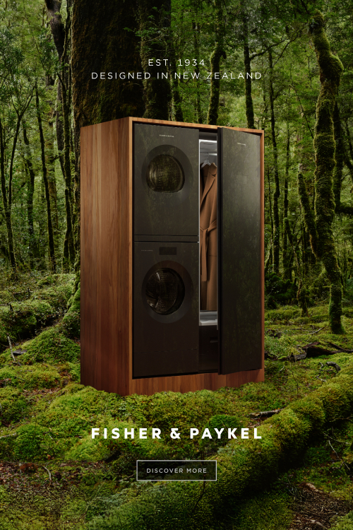
One of the clients is a chef, so the kitchen is also highly functional, with integrated Fisher & Paykel appliances providing the necessary advanced level of performance without interrupting the striking aesthetic. Doherty Design Studio suggested Fisher & Paykel to their clients, who “responded really well, they’d used Fisher & Paykel in a previous house and had loved the products”, Mardi tells. “The appliances are critical to the success of the kitchen”, she continues, reflecting on the fact that appliances are not typically something that needs to stand out, in fact “in most cases the appliances actually have to blend into the background”, she says.


Moving in to the living room, the expanse of bright red joinery (designed for the original owner’s music collection) was one of Doherty Design Studio’s main points of inspiration in the house. The space was updated to reflect the new owners’ personality through the refresh of an old bar and removal of a fireplace that separated the kitchen spaces from the living. “The client entertains a lot, and we wanted the room to be an extension of the kitchen and dining room so all spaces could be used together when required. We removed the fireplace allowing an opening through to the dining. Fluted glass steel doors allow the space to be closed off for smaller gatherings.” says Mardi. Recently stepping into the hospitality industry with a restaurant of their own, the social, almost retro-disco atmosphere of the living areas was a draw card for the clients.


The strength and character of the Kennedy Nolan design resonated with the clients when they purchased the house, now, Doherty Design Studio have added another chapter to its story. The home’s “bold, confident gestures” with colour remain as fresh and exciting as they were 18 years ago. Doherty Design Studio’s new layer responds and adds its own depth, ensuring the life and personality of the house continues to surprise and inspire.