
Sequential Chapters – Chapter House by Tom Robertson Architects
Tom Robertson Architects’ Chapter House is so-named for its division into two distinct chapters. Behind the double-fronted Victorian terrace, which was once the client’s childhood home, sits a new contemporary addition, lightly touching the original.
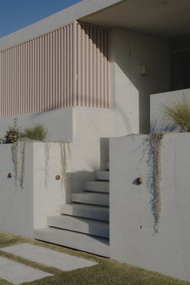
As the client’s childhood home, the original terrace had a special significance that informed the decision to create a deliberate separation between the old and the new, explains architect Tom Robertson. This was achieved not only through an aesthetic juxtaposition of the terrace with the new addition but by maintaining the original rear brick wall and back door of the home, and the addition of a skylight that intervenes between the pair of volumes that now constitute the home. “There is a lot of old charm in the front portion of the house, with high ceilings, original details, fireplaces and heritage bi-fold doors between the lounge room and a study,” Tom says. “We were very keen on maintaining the original character and reinterpreting the new component as something distinctly different. We didn’t hide the back of the terrace, and the new gently engages with the old part of the house.”

Entering the home, the central corridor leads to the original back door. Stepping through this door, the sudden presence of space and light from above is experienced, as though one has opened a door to the outdoors. Several concrete steps take the floorplate down a level, while the ceiling is cut away to allow for the skylight, introducing a contrasting strip of light and volume between the old house and the new addition. Each of these elements creates a sense that one has exited the old building entirely before immediately entering the new, despite the fact that the two are adjoined. While this transition is brief, and the moves to achieve it subtle, the effect is powerful. By marking the transition in this way, the architecture offers a continual reminder of its distinct chapters in the lives of two generations – first as the client’s childhood home, then as the family home in which her own children are now growing up.
Despite their differences, the two sections are united by a shared light, monochromatic palette. The materiality of the new addition, however, is intended to emphasise its minimalist, contemporary qualities. “Everything in the new section is deliberately clean, minimal, and light,” says Tom. “The beautiful Carrara marble and burnished concrete slab floor imbue the space with very cool tones, and a contrasting splash of dark timber joinery defines the northern wall of the kitchen.” The cement render that defines the upper level of the new addition is brought inwards, subtly adding texture and an industrial quality to the aesthetic, while black-framed full-height glazing imbues the space with light and creates a seamless visual connection with the outdoor deck and swimming pool.

While the expanses of glazing and the relationship between the indoor and outdoor spaces were a key aspect of the new design, it was also important to shade the interior from the western sun and to create a sense of privacy. The upper storey is positioned so as to shade the lower level and protects the threshold between the kitchen and dining spaces and the outdoor deck. “Even though there’s a lot of glass, it still feels safe and private,” Tom says. This sense of seclusion is enhanced by the careful attention paid to creating distinct zones within the otherwise open lower level. The transition from the kitchen into the living space is marked by a step down, and a shift in the materiality of the floor from polished concrete to carpet. The ceiling also reflects the change, moving from flat plasterboard in the kitchen and dining zones to an exposed rafter ceiling in the living area, a texture that amplifies awareness of the protective shelter overhead.
From the carefully preserved character of the original terrace to the equally considered design of the new addition, Chapter House sees contrast used to define and express context. By articulating the difference between the two portions of the home, each is given its due. Perhaps more importantly, the heightened chronology evident in the architecture serves to represent the client’s personal history with the house, which above all, is what gives the home its meaning.