An Inward Focus – Quarry Hill House by Chelsea Hing
Quarry Hill House is a contemporary family home in the regional Victorian city of Bendigo. Featuring an extensive interior fit-out by Chelsea Hing, this project demonstrates the studio’s ability to enhance the ideas embedded in the existing architecture by reimagining spatial sequences and introducing a palpable sense of energy inspired by the client’s lifestyle.
Engaged by the client in the later stages of this new build’s project cycle, the designers’ scope focused on improving the layout and bringing intrigue and depth through a series of strategic interventions and additions. As the studio’s Founder and Director Chelsea Hing says, “It’s quite an inwardly focused home in the sense that the connection is strongly to itself because of the location of the windows, the orientation on the site and the aspect.” She continues that “whilst there is a very strong landscaping vision wrapping the house and grounding it, the reality for me is that it looks in on itself.”
This is largely due to the double-height void that punctuates the plan at the entrance, and many of the most compelling interventions – relating to both layout and materiality – are illustrated in this space. Stretching through the house to the rear living area and flanked by bedroom wings on either side, its vastness was initially overwhelming. “We had to explore how to introduce a sense of intimacy to this expansive space,” Chelsea notes.
With the building’s foundations already laid, materiality was instrumental in this pursuit, and the designers’ ability to confidently build the palette with contrasting yet complementary textures and tones is significant to this project’s enduring identity. As Chelsea says: “We see this as a very strong interiors project, and the materials are what gives it gravity, grace and solidness.”
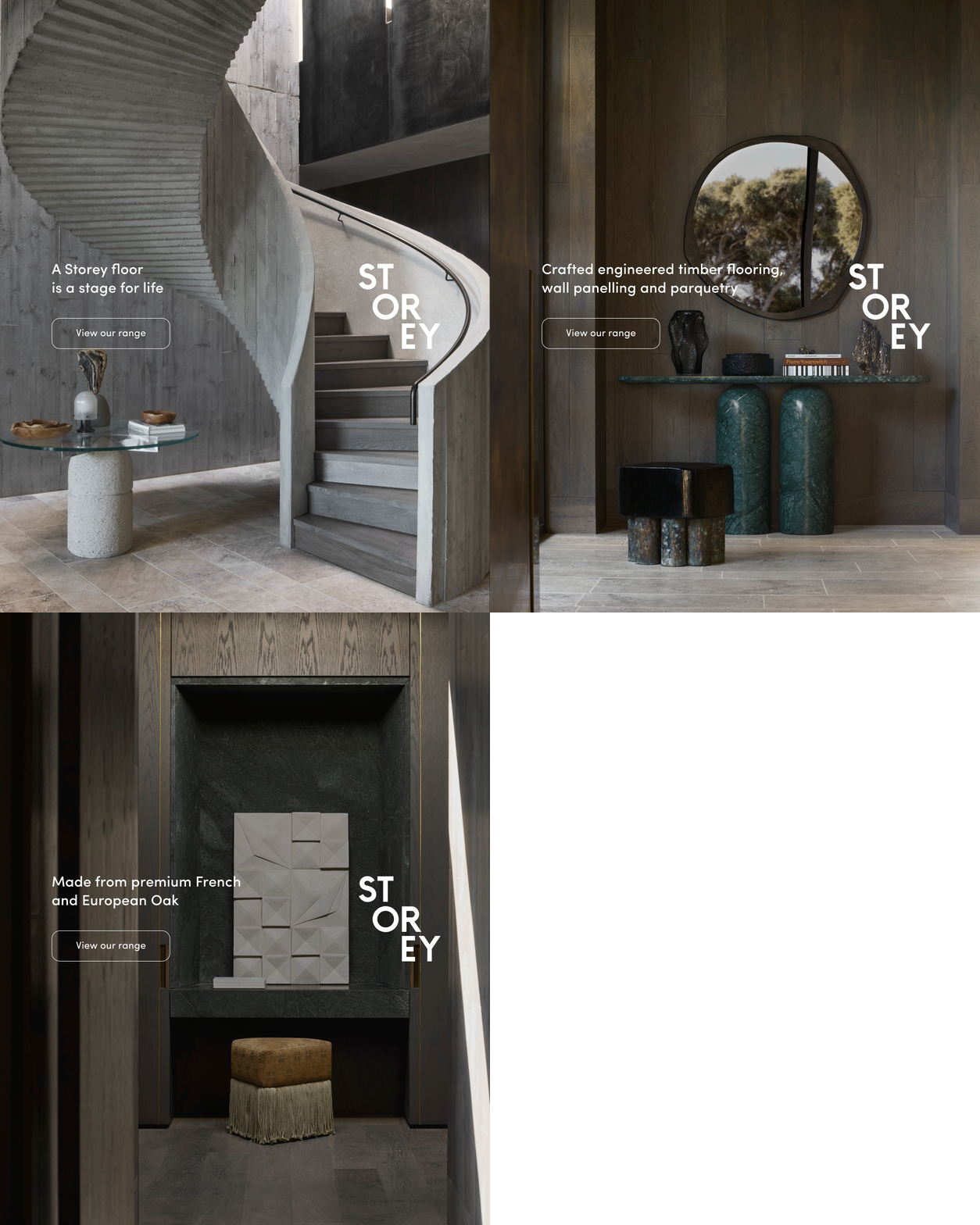
The use of timber, specifically, is integral to this narrative. “We were really trying to avoid plasterboard as much as we could, so we instead looked to create an interplay between interesting materials.” In the void, Made by Storey French oak boards have been used with gusto; Truffle clads the walls on both levels, whilst Cloud wraps the ceiling and floor between. The junction of Truffle’s dark chocolate tones and Cloud’s light oak finish is visually pleasing, and Chelsea attests to the value of this material in the resulting energy of the space. “I really can’t underscore enough the importance of the timber in doing the heavy lifting here – it’s a significant element, and we were able to push this outcome thanks to Made by Storey’s offering,” she says.
The dexterous material response is supported by an intelligent interpretation of the layout, particularly within this key area of the home. “A lot of our work focused on getting the central spine of the house right,” Chelsea explains. “It was a rabbit warren of doors with a series of openings, so we worked hard to clean that up.” The result is three discreet doors in lieu of multiple thresholds, all with deep reveals. These openings punctuate the timber-clad walls alongside purpose-designed nooks for large-scale artwork and custom joinery, bringing a distinct rhythm to the challenging void area. Consequently, this move enhances the overall spatial sequence and facilitates warmth through a carefully curated selection of artworks and objects.
An exploration of haptics and hues continues throughout the rest of the home. The office is vibrant and energetic with furniture, textiles and art in warm ochre shades against the concrete’s cool finish; the master suite is a study of quiet luxury with lush textiles and stone; and Made by Storey’s French oak boards are recurring in almost every room, bringing a wonderful sense of cohesion. As Chelsea explains, many of these prevailing finishes and shades simply cannot be communicated through renders, and as such, each project demands faith and conviction between architect and client. “The client’s trust is so important, and then I like to hit it out of the park to take them further and have a bit of fun – I think we should be able to do that,” she offers.
Quarry Hill House exemplifies this sentiment. It is the often-underestimated finishes and details such as the microcement in the ensuite – for which Chelsea counts “the hand of the artisan” as “integral to the finished result” – or the layered palette, which has developed organically over the course of the project, that bring flashes of heightened beauty, ultimately distinguishing one project from another.
For Chelsea, these are the moments that bring meaning to her practice. “I think that’s what we’re doing as designers – trying to create an emotional outcome from a built form,” she says. “We talk about planning, materiality and the interplay of light, but ultimately the broader purpose is: how do we design a home to hold everything a client wants and frame their next phase of life?” It is a compelling insight and, as Chelsea concludes, what she believes to be “the untold story” of domestic spaces.

![Book Flatlay Cover Front Transparent Trio[1]](https://d31dpzy4bseog7.cloudfront.net/media/2024/06/07080212/Book_Flatlay_Cover_Front_Transparent_Trio1.png)


