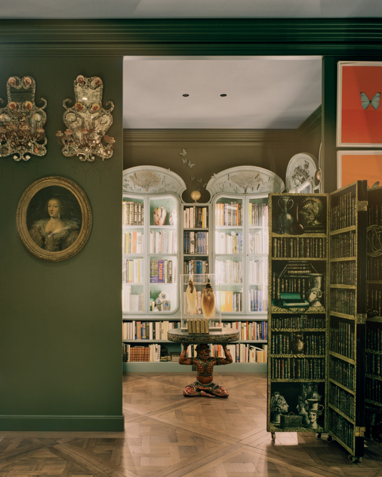
Haptic Feedback – Redwood House by Studio Terpeluk
Redwood House sits on a hillside in San Francisco’s charming Noe Valley. Originally designed in the 1970s by prominent local architect, Albert Lanier, the house has undergone an extensive yet sympathetic renovation by Studio Terpeluk, ushering it into a new epoch with integrity and vigour.
“When I first walked into the space several years ago, I was completely enamoured with the scale, geometry and volume of it,” says architect Brett Terpeluk. “There was something so peaceful, calming and embracing about the space that I felt immediately connected to the architecture.” Retaining this essence was essential to Brett and the clients, and as such, the scope focused on “leaning up” the detailing and materiality, enhancing the existing volumes and increasing the square footage.
As Brett says, the home’s unusual footprint and layout provided intriguing foundations from which to work. “This house is very unique in that instead of having a monolithic house with a street presence and large backyard, it’s broken down into a series of courtyards and volumes.” This stacked layout results in a combination of activated and quiet moments enlivened by views of the cityscape and landscaping at the home’s edges. As well as sightlines, texture plays an important role in animating the interiors. The original redwood remains a prominent feature, and the staircase is one of Brett’s favourite moments for the “haptic feedback” it provides upon touching the curved steel handrail.
The clients’ love of colour can be seen in the exciting collection of furniture and artwork, as well as in the bold tones throughout. “We decided the colours should be very high gloss, high vibrancy so that you have this polarity of experience between the light-absorbing, rough, matte redwood panelling and these pure, simple colours that reflect the sunlight.” Working with a close friend and colour consultant, Beatrice Santiccioli, who “lives in the chromatic world and has this exquisite ability to understand and harmonise colour with adjacent spatial fields” proved advantageous as the resulting palette sees bold colours realised with softness and subtlety. Cleverly, this colour scheme helps to re-contextualise the redwood within the home, resulting in a newfound sense of harmony within these walls.
Brett speaks to this sense of unity as being one of the project’s biggest strengths. It creates a condition within which the integrity of the architecture can be fully appreciated, referring not only to Studio Terpeluk’s insertions and additions but also to Albert Lanier’s original design.